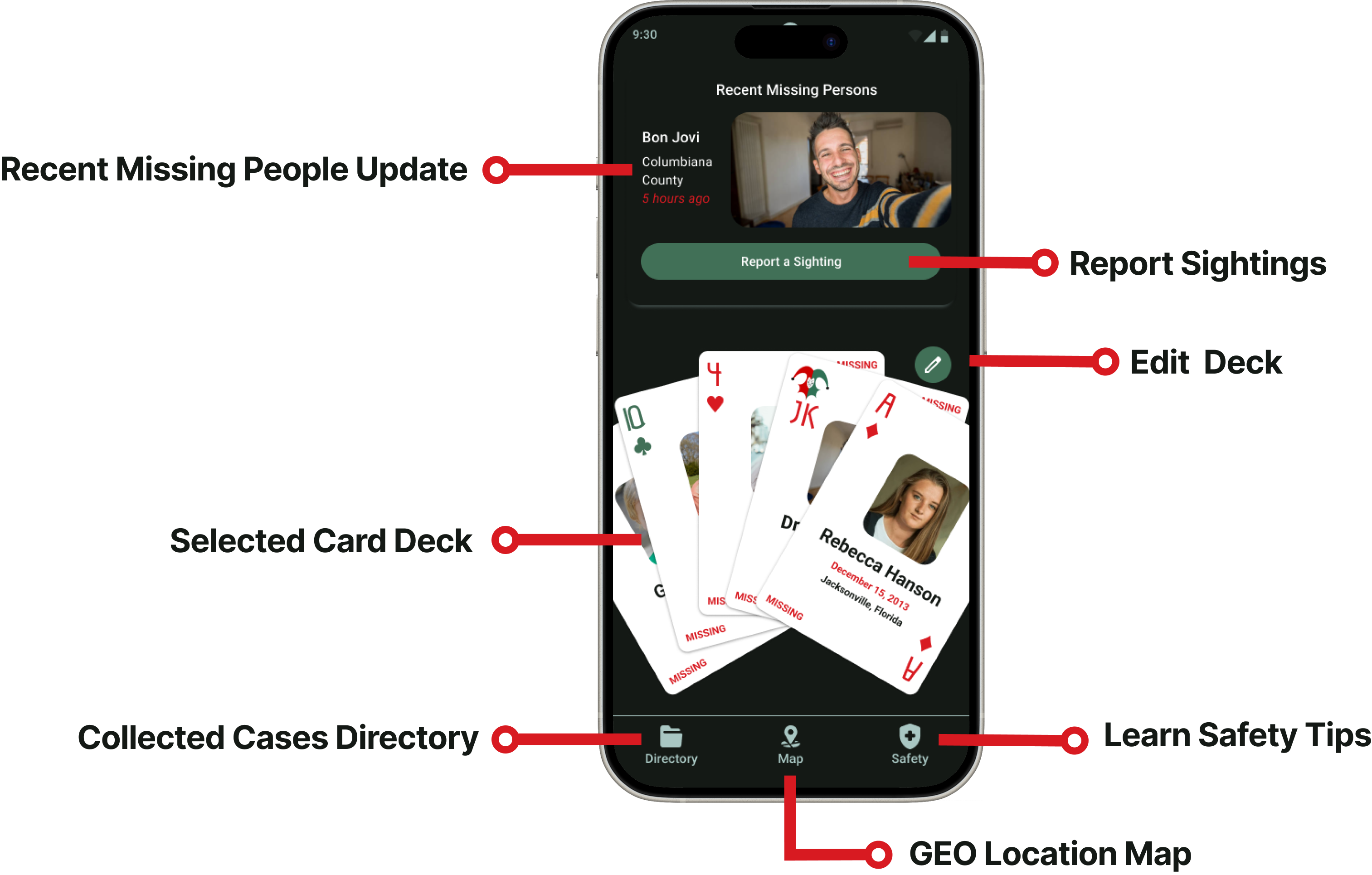
Overview
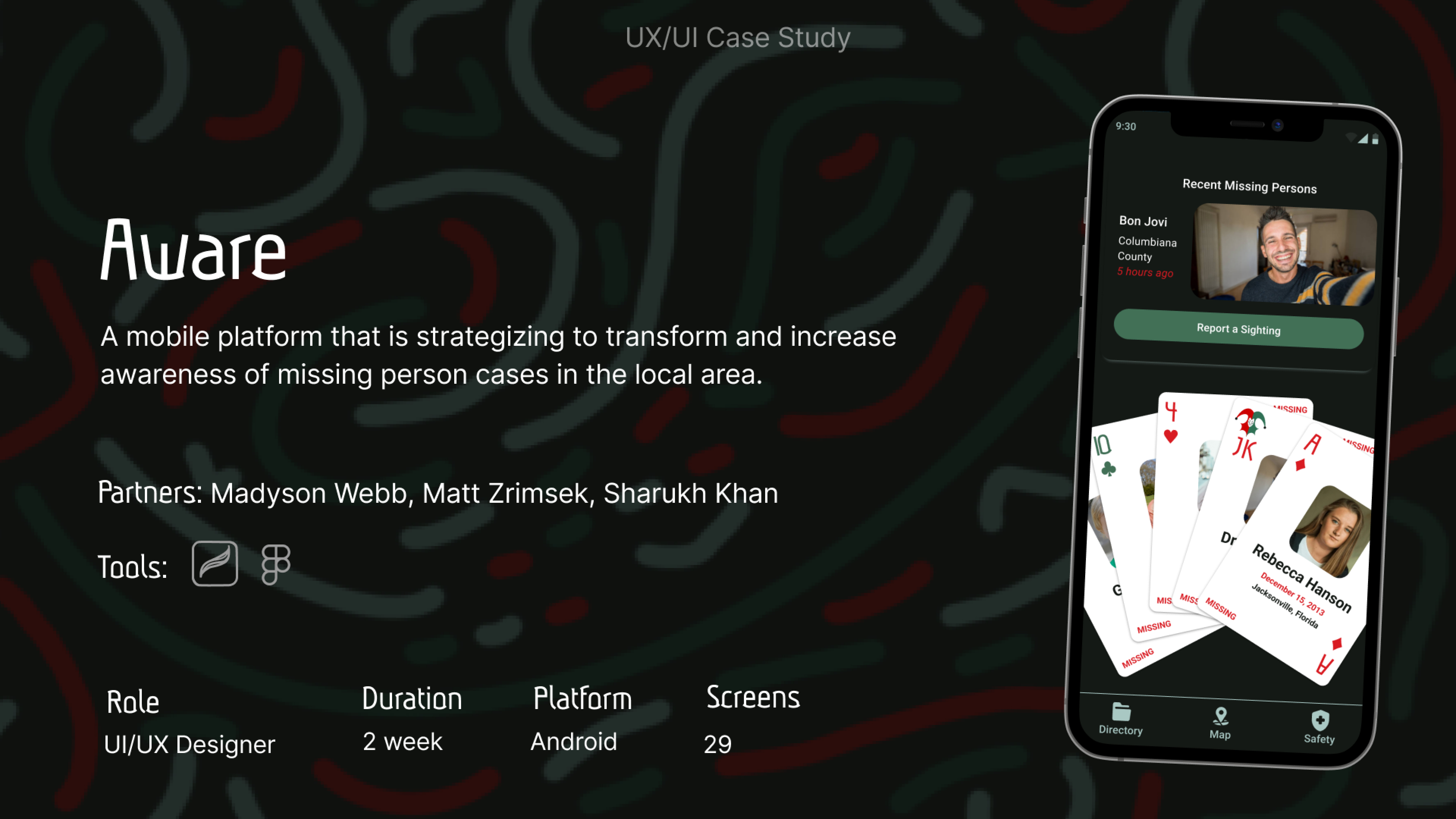
Aware is a mobile platform that is strategizing to transform and increase awareness of missing person cases in the local area.
I had the largest presence in the overall application of our styles within the designs and general branding of the project.
The Problem
We believe providing an easily accessible and engaging database of local missing persons cases for Concerned Individuals will impart better awareness and preparedness, leading to a more secure community.
The Solution
Aware is developing a platform to increase awareness of cold cases, enabling individuals to learn more about unresolved investigations and actively contribute to their resolution and prevention.
We’re better because there is nothing like this in the market.
We’re believable because this is based on the successful use of analogue cards in a Detective’s investigation.
The Problem
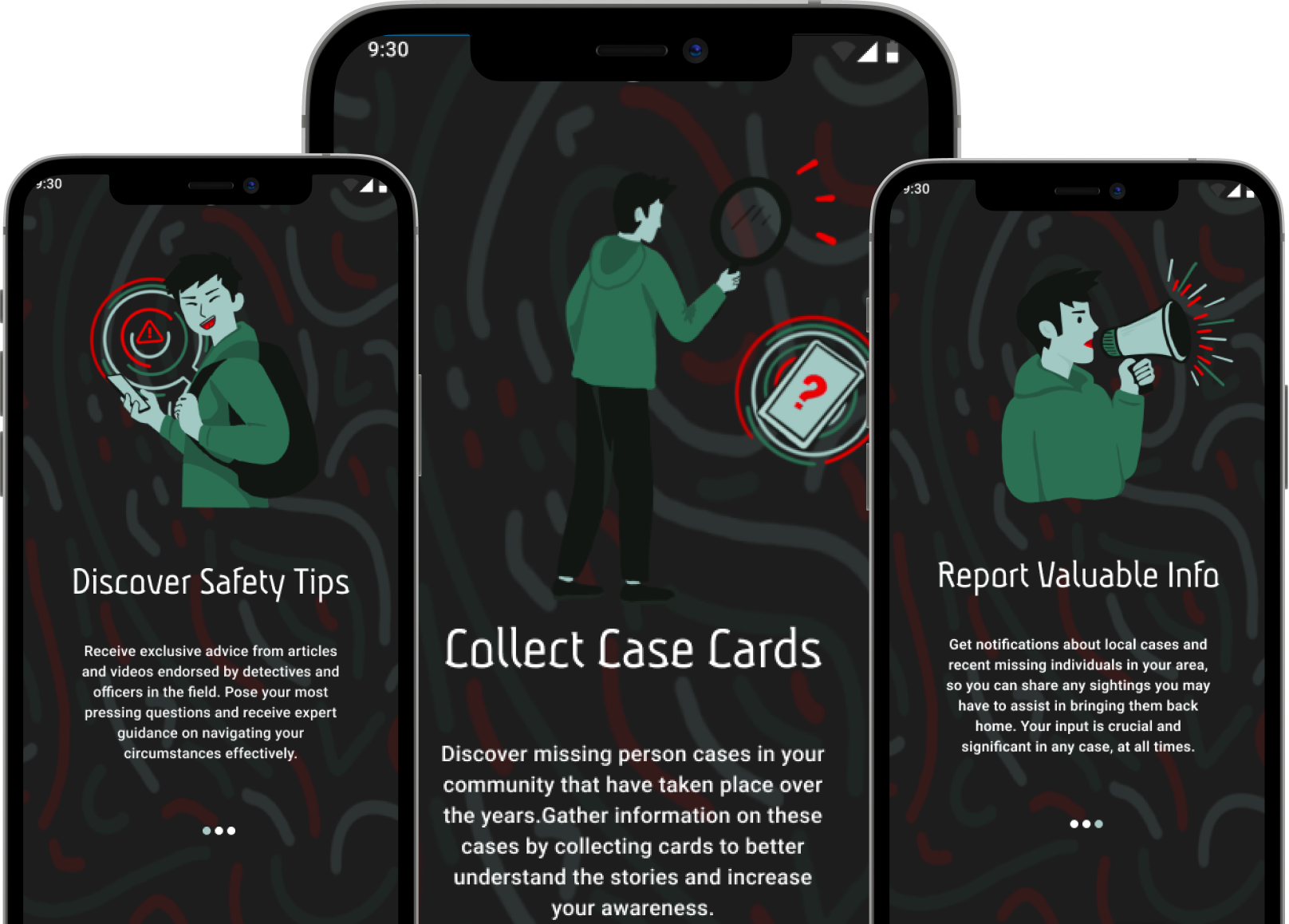
We believe providing an easily accessible and engaging database of local missing persons cases for Concerned Individuals will impart better awareness and preparedness, leading to a more secure community.
We’re better because there is nothing like this in the market.
The Solution
Aware is developing a platform to increase awareness of cold cases, enabling individuals to learn more about unresolved investigations and actively contribute to their resolution and prevention.
We’re believable because this is based on the successful use of analogue cards in a Detective’s investigation.

Research
To design the Aware app to be more accessible and user-friendly, we conducted comprehensive research that included user interviews, surveys, and usability testing. We engaged with concerned family members, law enforcement, and individuals passionate about missing persons cases to understand their needs and challenges. We also analyzed current accessibility standards and best practices in app design.
How we developed our questions
We used these interview questions to gain a deeper understanding of user behavior, needs, and pain points related to local safety and missing persons cases. By asking about personal experiences, challenges, and preferences for receiving updates, we aimed to uncover insights into how users currently interact with safety information and what features they find most valuable. This helped us identify gaps in existing solutions, understand the relevance of missing persons cases in their daily lives, and ensure the Aware app is designed to meet real user needs and provide timely, accessible updates.
What were our interview questions?
- Can you share a recent experience where you wished you had better local safety information?
- What difficulties do you face when trying to stay updated on safety issues?
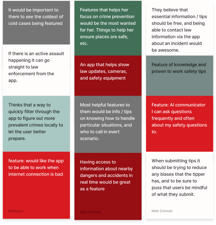
- What features would be most helpful for you in a safety app?
- How do you prefer to receive updates and alerts about safety issues?
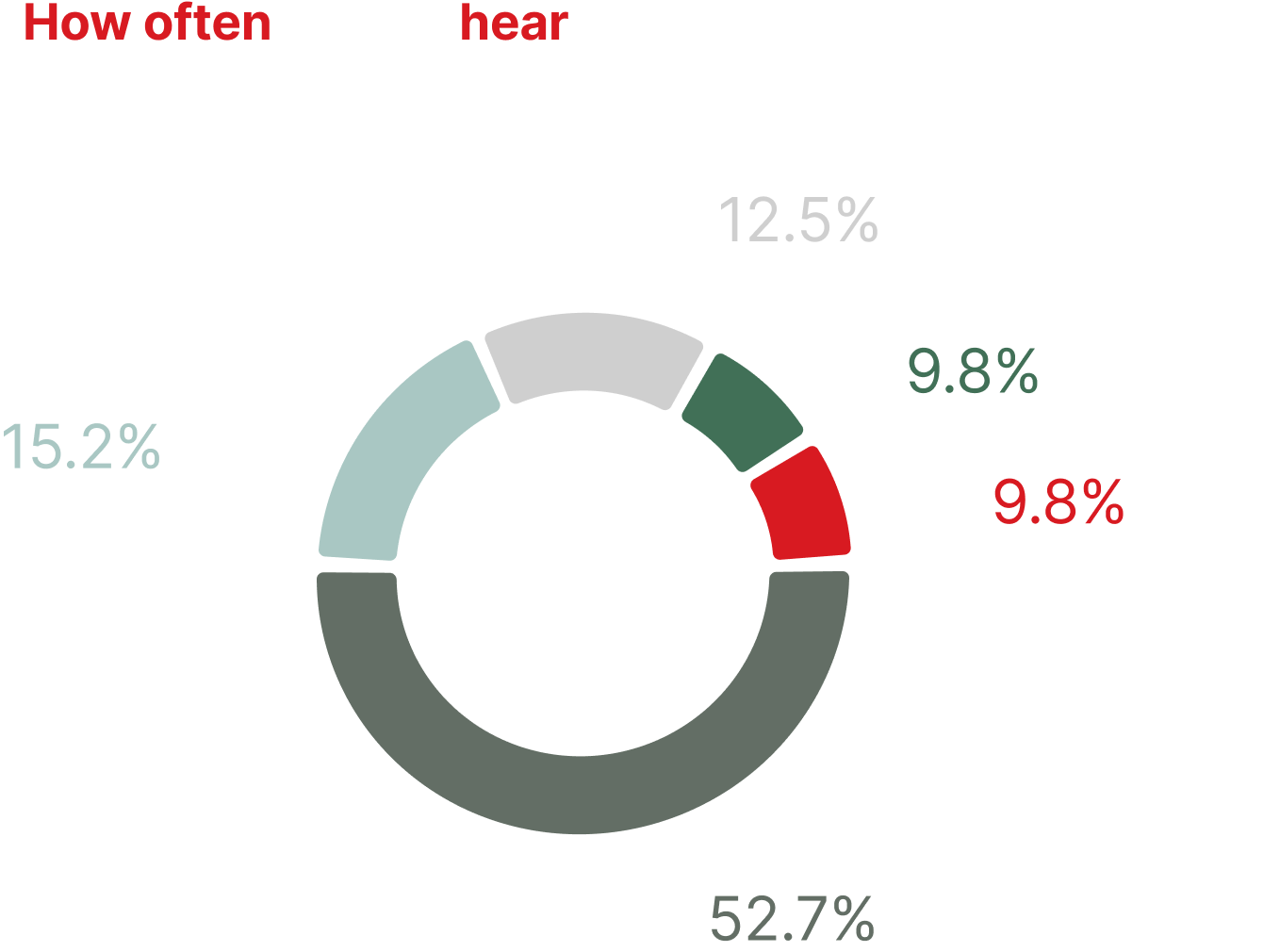
- How do you normally hear about missing persons cases?
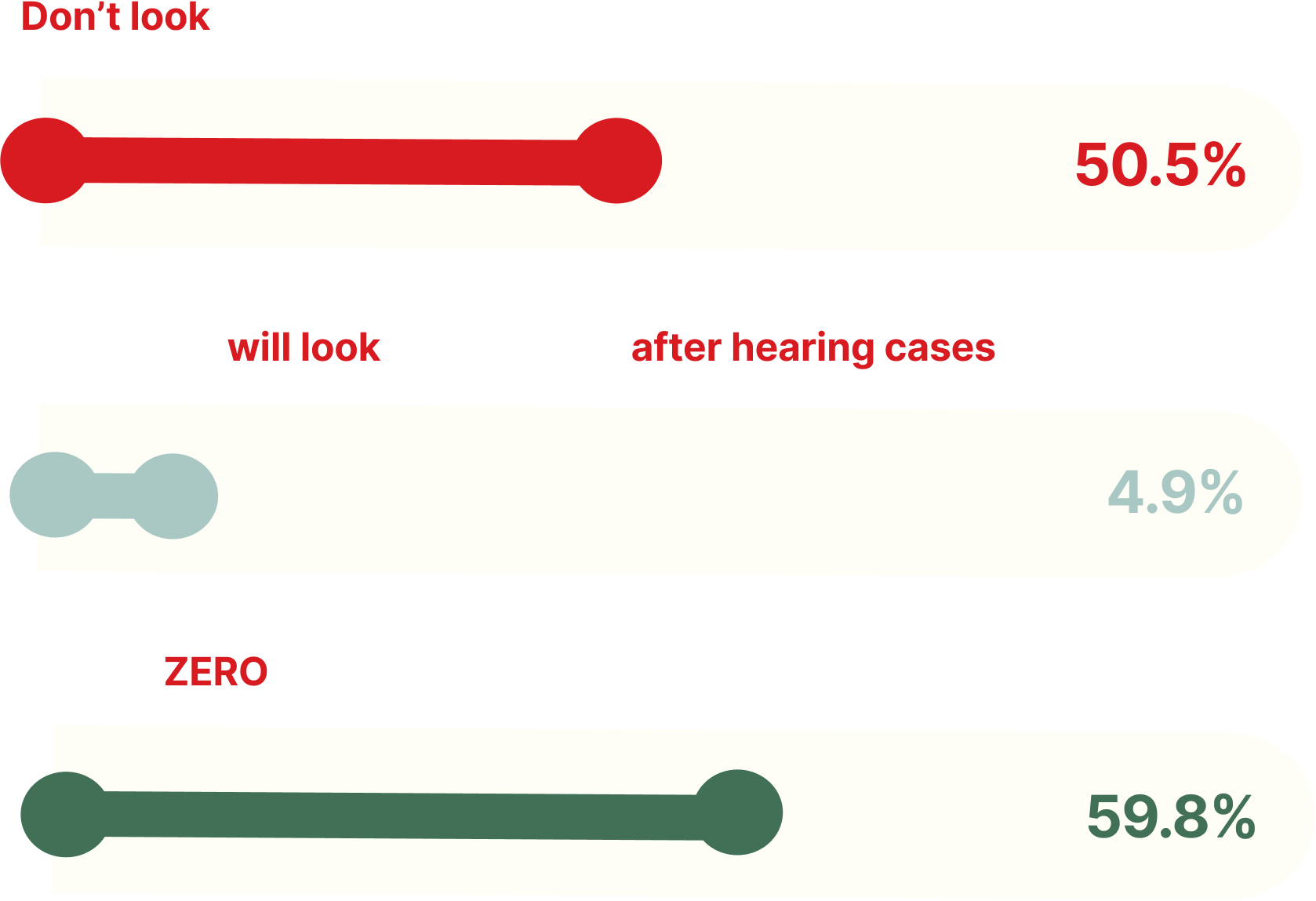
- Do you research / look into local cases for missing people?
- Where do you look for missing persons cases?
- Are you interested in learning more about missing persons cases?
- Do you believe keeping up to date on missing's persons cases is beneficial to you?
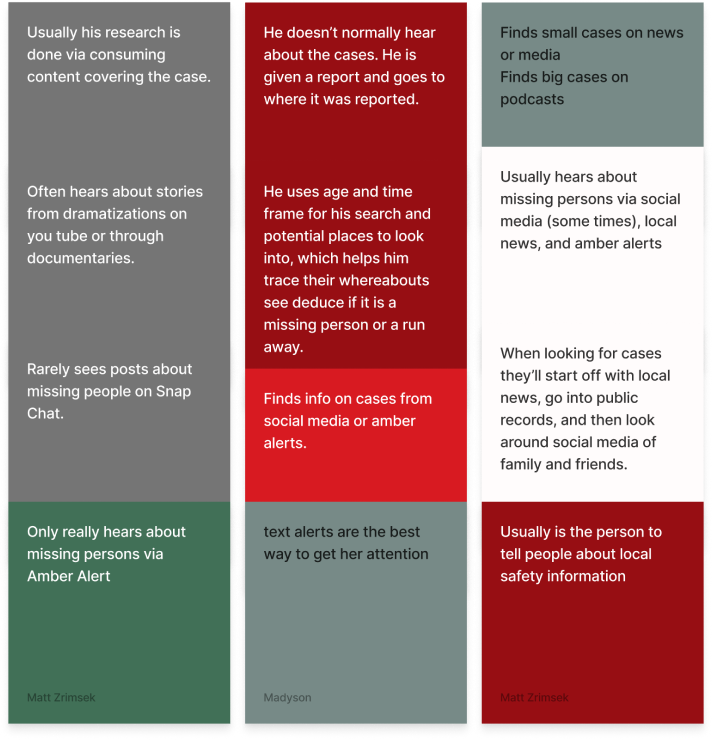
Affinity Diagram
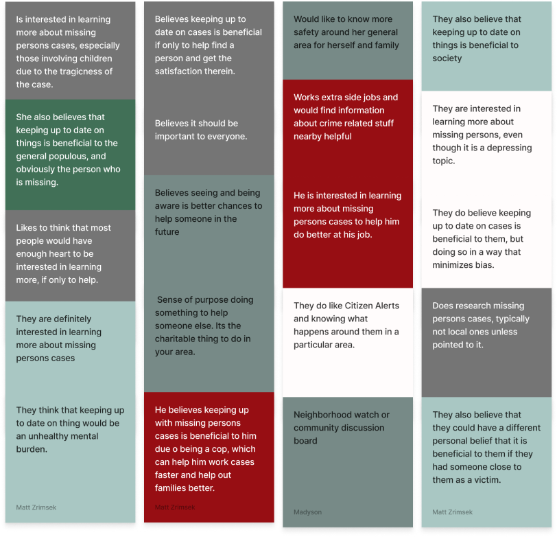
We interviewed 6 people and grouped their user insights into categorized patterns, helping us focus on the most important features for building the Aware app.
Research Sources
Info Problems
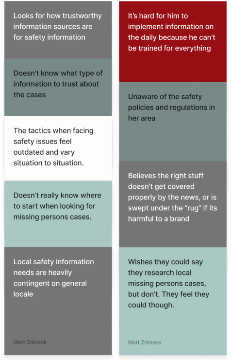
Safety
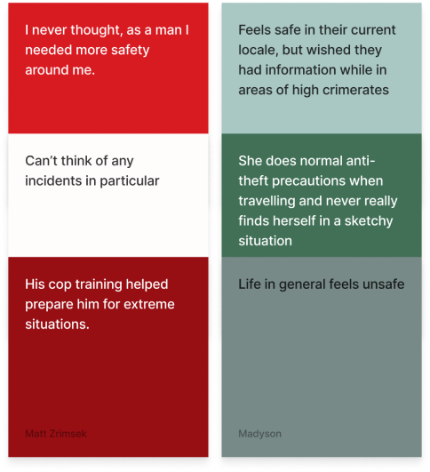
Lack of Engagement
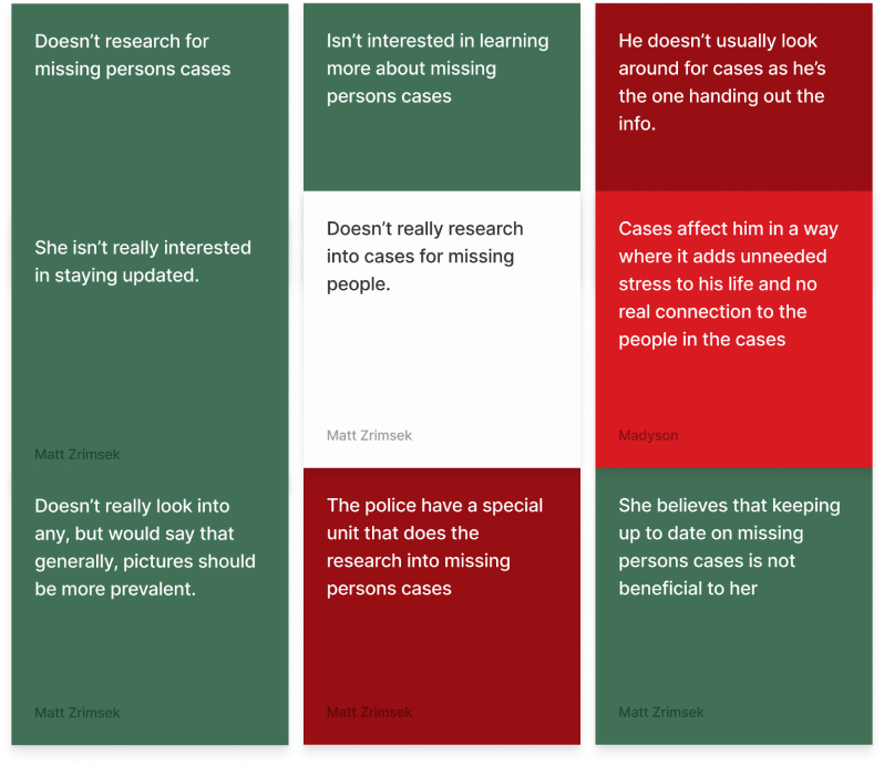
Notifications
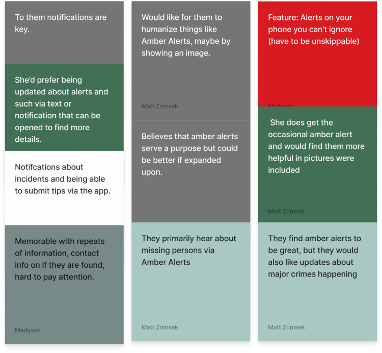
Engagement Benefits
Features
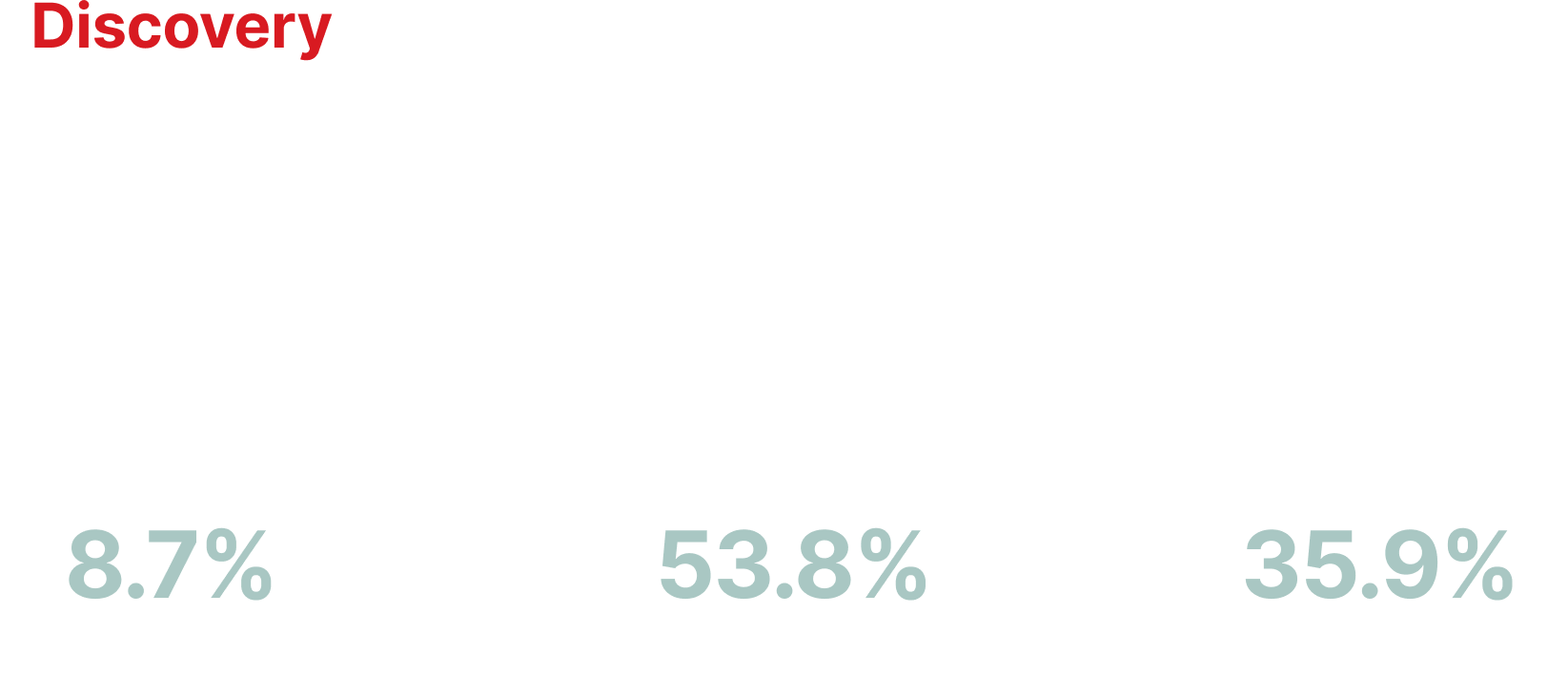
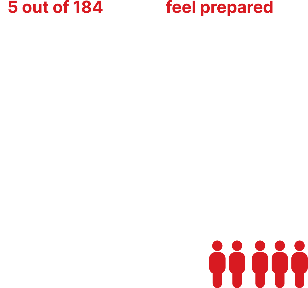
Survey Insights
Our survey collected data from 184 participates
Competitor Analysis
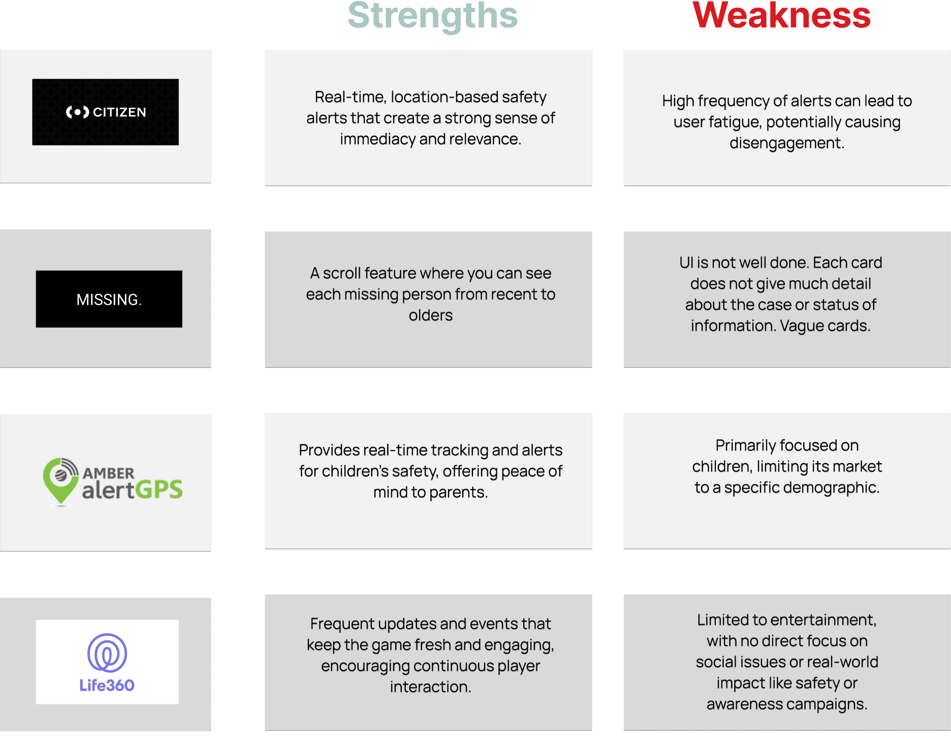
Upon reviewing various safety applications, we conducted competitor analysis to identify effective and ineffective features. This process has enabled us to enhance our efforts in raising awareness and retaining users by offering a fresh yet familiar experience.

Definition
Problem Statement:
We are confident that streamlining the page layouts and improving content organization for GRIN will lead to a higher click-through rate and reduced traffic loss.
This will ultimately boost volunteer sign-ups and encourage more donor contributions.
Value Proposition:
Our organization, GRIN, is currently developing a user-friendly website navigation and design aimed at making it easier for volunteers and donors to sign up and contribute. We stand out due to our commitment to supporting Gahanna Community residents.
Our credibility stems from our transparent operations and our enduring dedication to providing food to our community, a mission we have been fulfilling for the past 50 years.
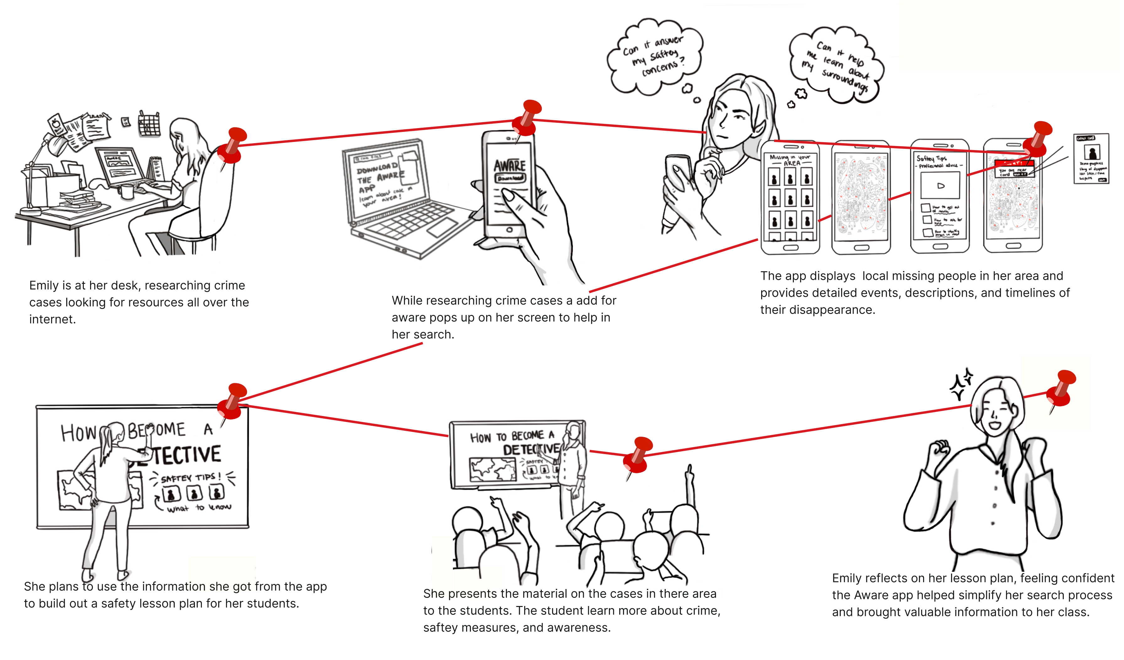
Finally using all of our research via interviews and a survey, we collated our Affinity Diagram into our Persona which we then used to create our User Scenarion and move foward with a StoryBoard that mapped out Chris' general experience with our solution.
User Persona
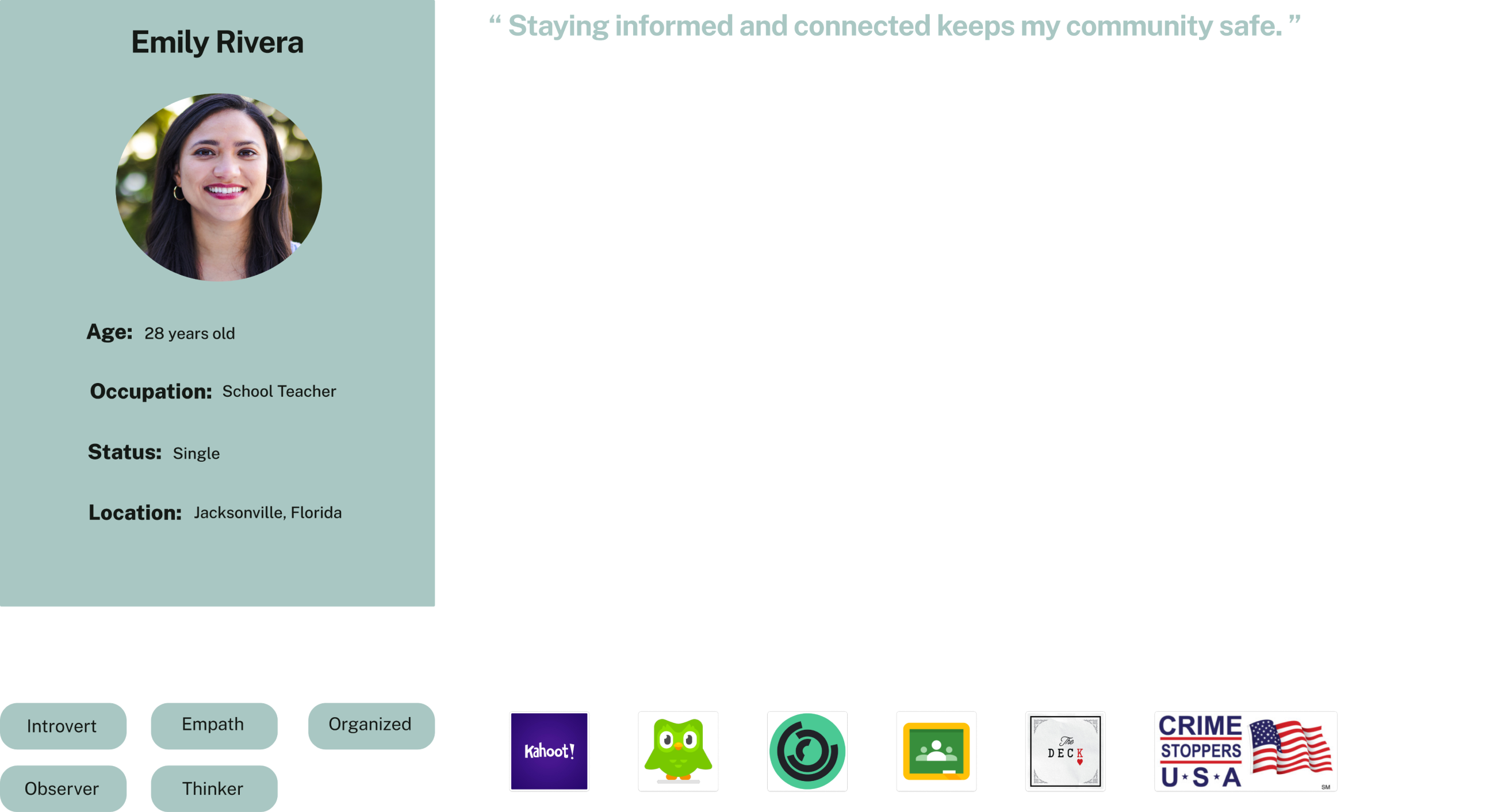
Introducing Emily, an earnest high school educator who is committed to equipping her students and community with the information they need to stay aware and support each other. She keenly senses the weight of responsibility for their safety and overall welfare.
User Flow
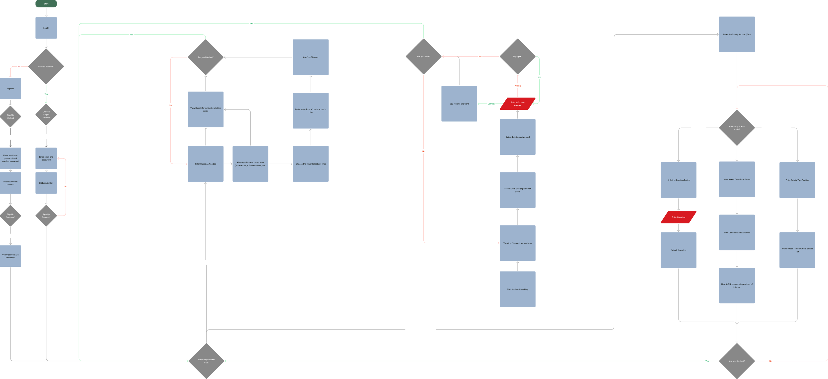
This procedure provides a detailed guide for users on how to access essential information on the website.
It outlines the necessary steps for engaging in key activities, such as signing up for donations, volunteering opportunities, and subscribing to the newsletter.
By following these instructions, users can easily navigate the site to participate in these important activities and stay informed.

Ideation
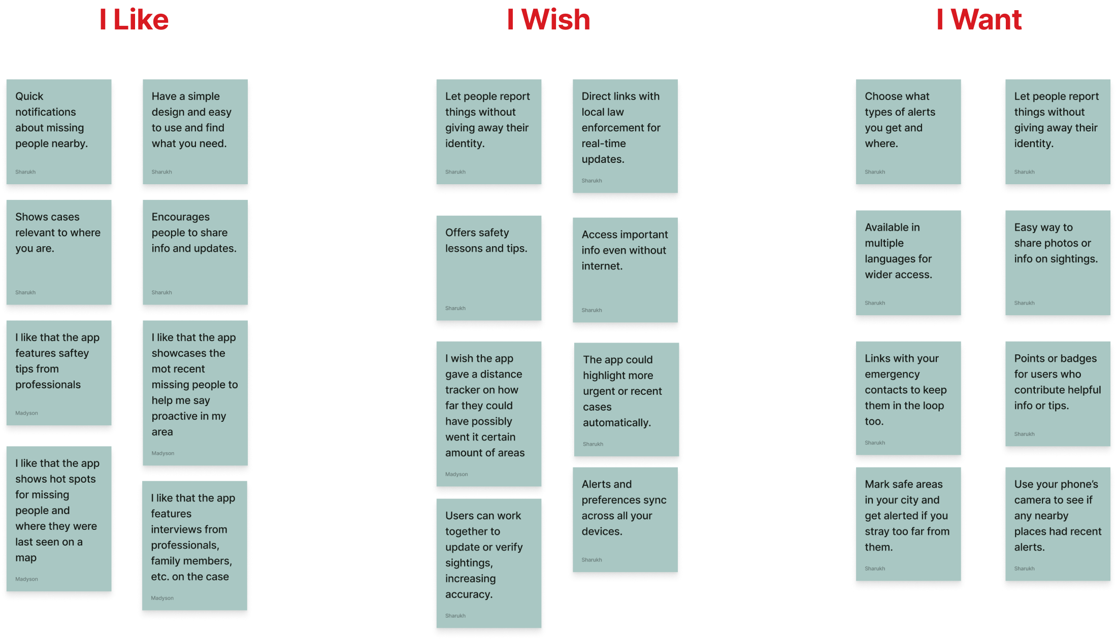
I Like, I Wish, What If...?
We engaged in the I Like, I Wish, What If? Ideation activity, a structured brainstorming exercise, to explore and develop strategies for addressing the specific pain points highlighted in our research findings.
Through this process, we examined various ideas and possibilities, which allowed us to refine and articulate the overall Value Proposition Statement that we collectively decided upon for our project.
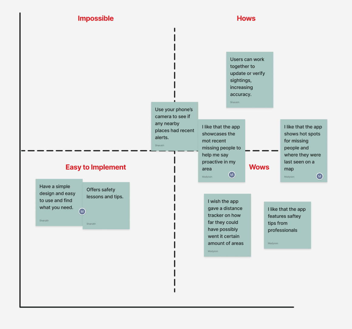
Feature Prioritization Matrices
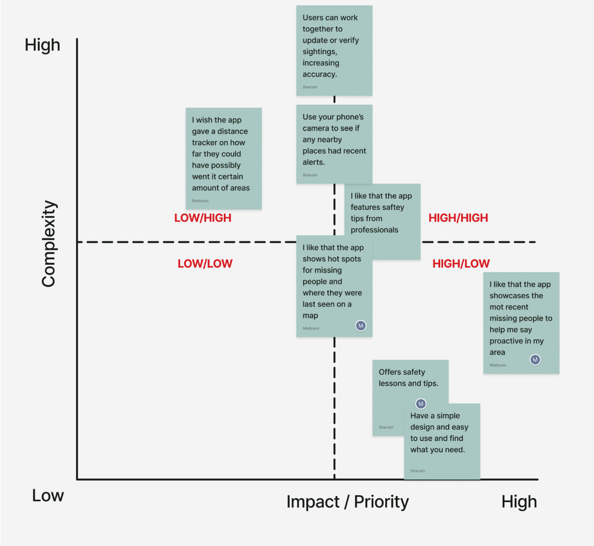
Following the ideation activity, we proceeded to create a feature prioritization matrix. This tool helped us evaluate and rank the brainstormed ideas generated from the I Like, I Wish, What If? exercise.
By using this matrix, we were able to systematically determine which ideas were most feasible and valuable to pursue, allowing us to make informed decisions about which concepts to advance in our project.


Designing & Prototyping
Style Guide
To start, we developed a comprehensive Style Guide following the creation of our initial low-fidelity wireframes. This approach ensured that, once we complete our initial round of testing, we will be well-prepared to apply the established Styles effectively
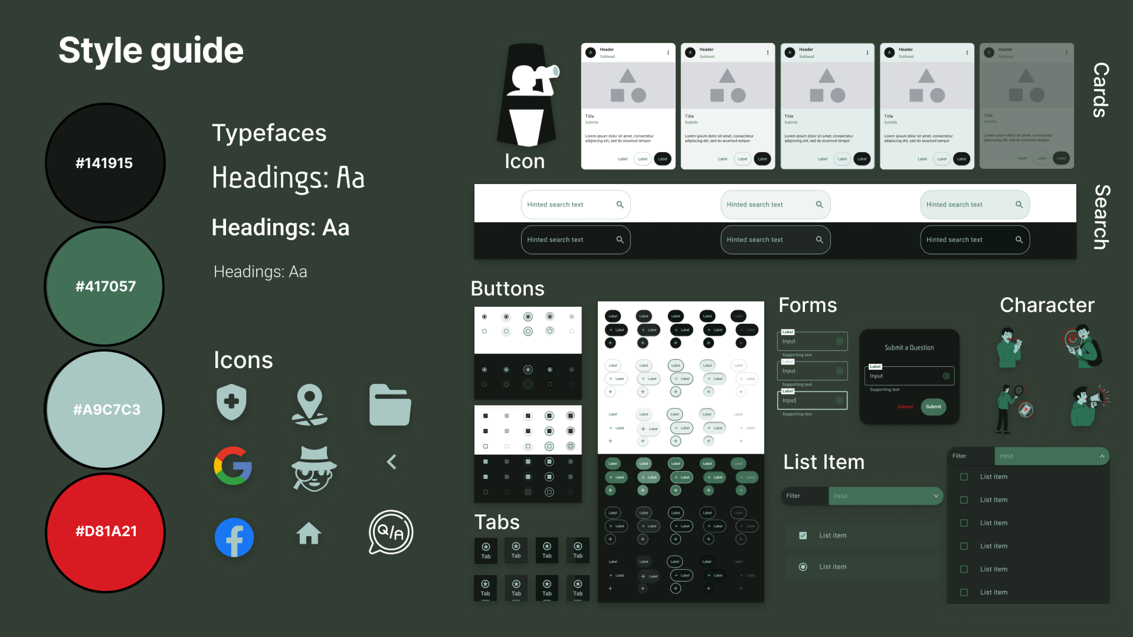
We approached our design process in three distinct stages. We began with Low-Fidelity designs to establish the basic structure and functionality. Following this, we refined and stylized these designs into Mid-Fidelity versions, incorporating more detailed elements. Finally, we addressed and integrated any feedback received to produce the High-Fidelity designs.
Low Fidelity
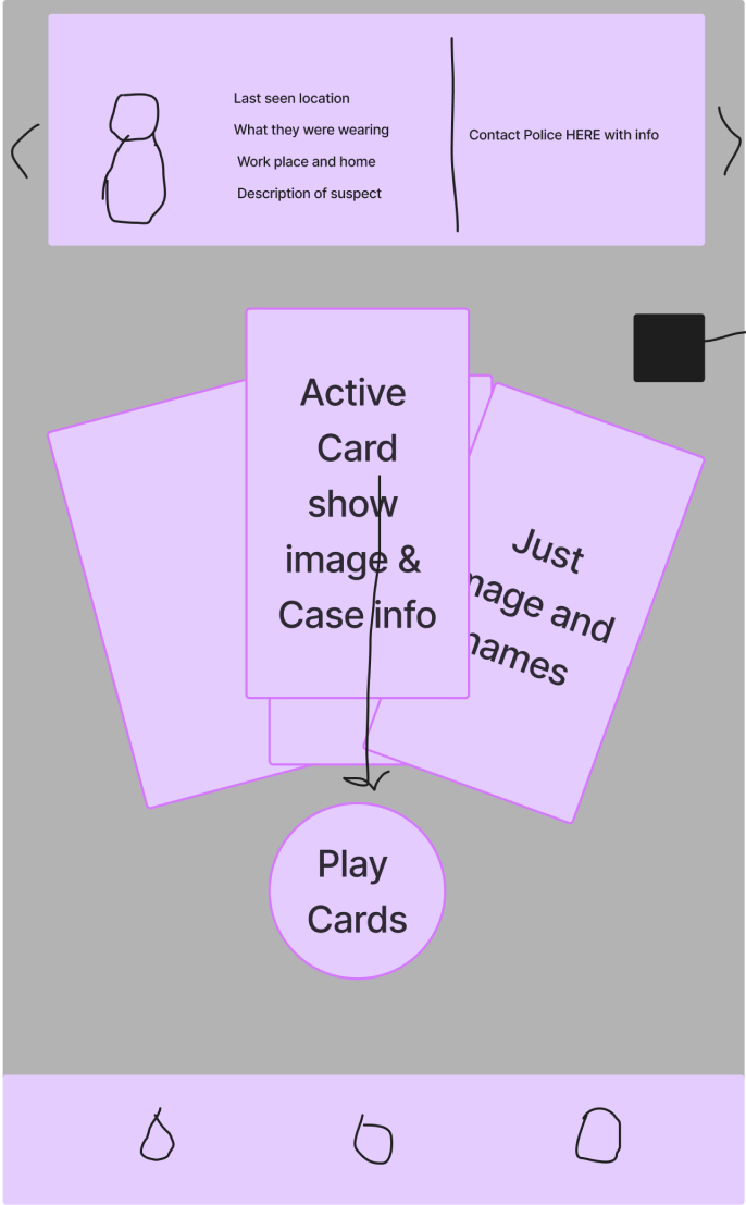
Inital Sketch

Testing Changes
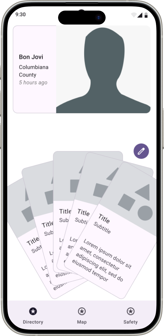

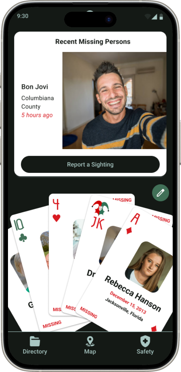
Clarity
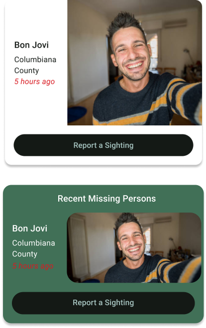
We cleaned up and made it more apparent how the user accesses the Recent Missing Persons details.
Directory Filtering
We implemented the mass card filtering within the Card Directory for ease of viewing.
Sizing
We updated sizing for some items, like icon buttons, to make them easier to see and click.
Card Design Iterations
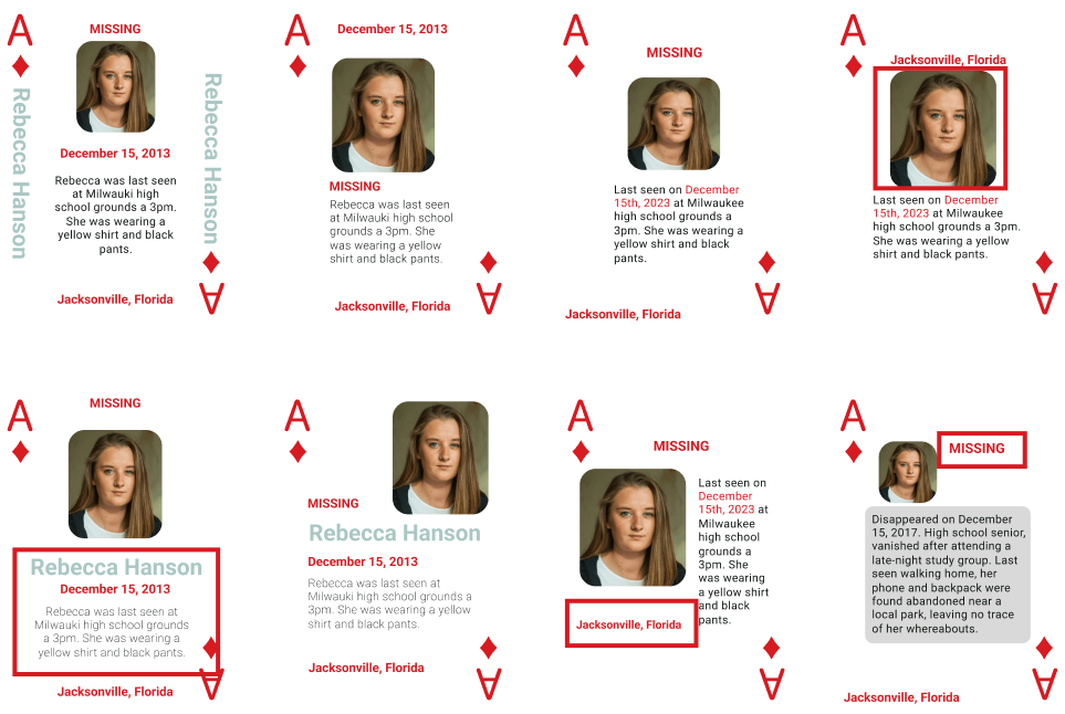
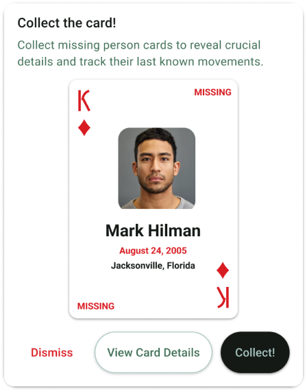
The cards are designed heavily off the original created by a detective in Florida. The red outlines on the cards are different elements of versions of the card we liked best to implement in the final card design.
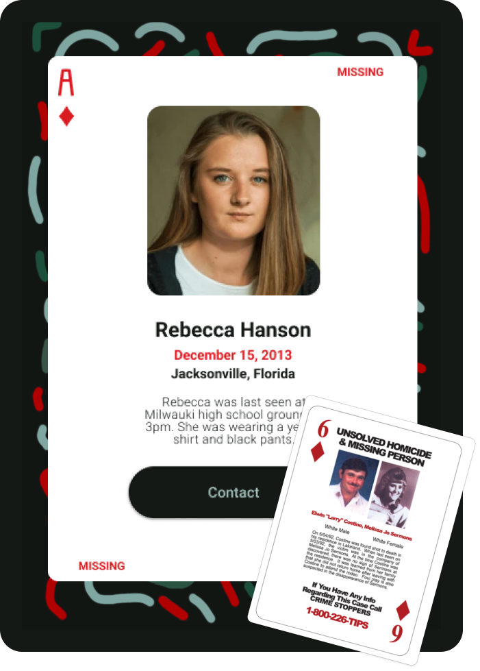
Before Usability Study
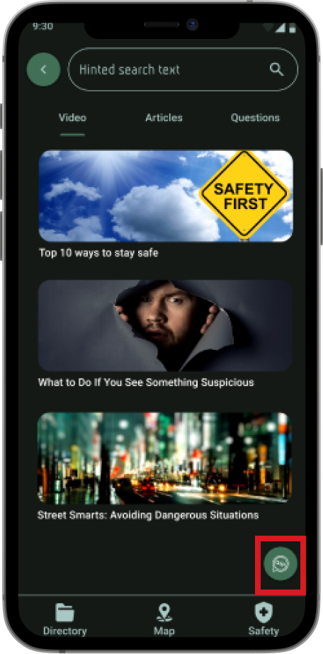

After Usability Study

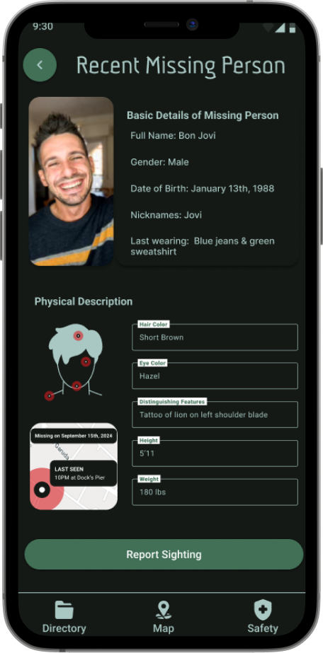
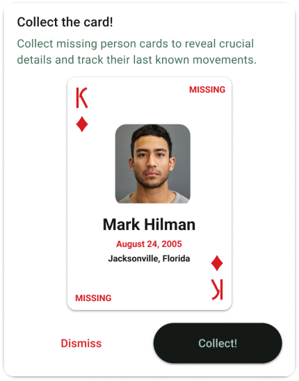
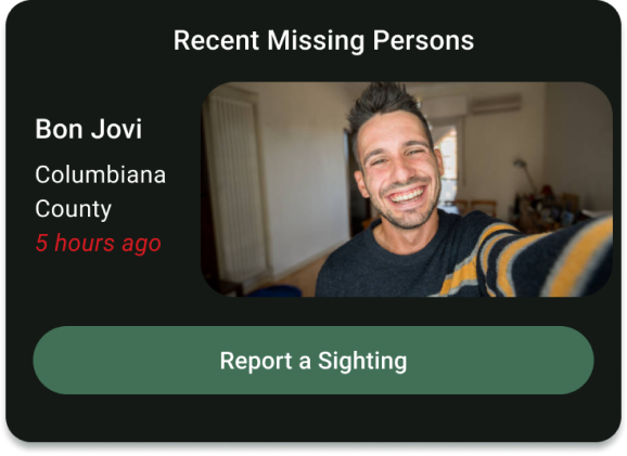
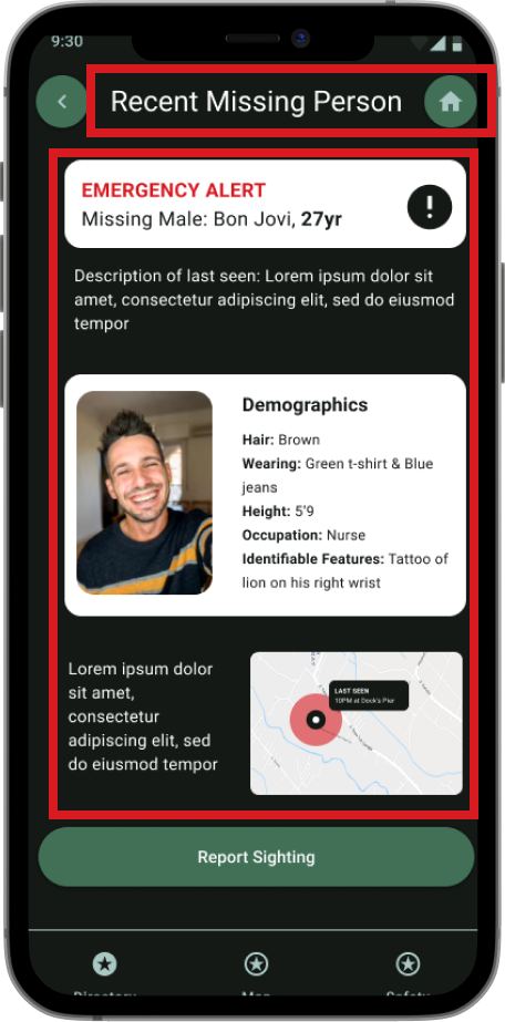
The highlighted element on the left display things we saw needed changed after testing the mid-fidelity. We changed button and test sizes/fonts. Redesigned key features format and color scheme to relieve the chunkiness feel to them and got rid of screen to make the one tap experience more accessible.
Before Usability Study


The highlighted elements above display things we saw needed changed after testing the mid-fidelity. We changed button and test sizes/fonts. Redesigned key features format and color scheme to relieve the chunkiness feel to them and got rid of screen to make the one tap experience more accessible.
After Usability Study


High Fidelity

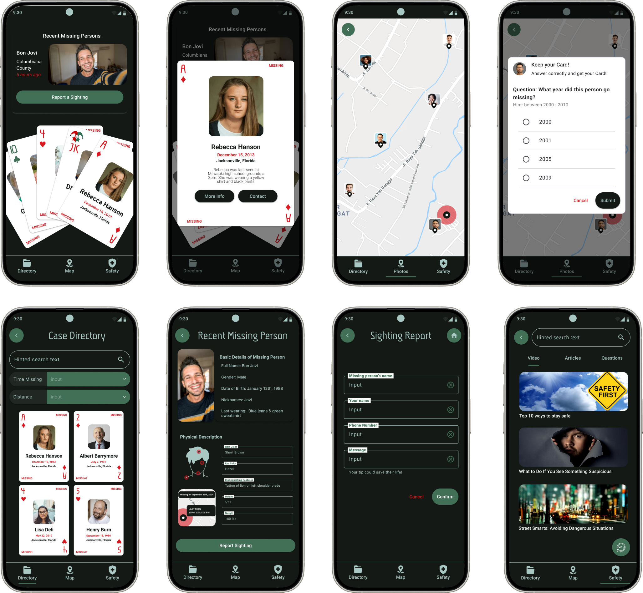
Final thoughts
Our design journey is all about putting users first and crafting experiences that really connect with them. We’ve learned that great design isn’t just about looking good, it’s about making people feel like the product was made for them. Through every project, whether it was through research, testing, or tweaking the smallest details, We focused on creating something that feels natural and meaningful to use. Every step taught us to listen more, adapt quickly, and never stop improving. We are excited to keep growing and tackling new design challenges ahead