Overview
I worked with my group to do the research, and largely led the direction for our general design style and subsequent style guide.
Project Overview
The Problem
The primary issue stemmed from the disorganized overload of information that users encounter upon visiting the website.
It lacked clear readability and appropriate visual cues to seamlessly guide users through the content.
This is what we believe.
The Decisions
Our design decisions are rooted in valuable insights gained from an interview with Brenda Johnston, Executive Director of GRIN, and rigorous user testing of early prototypes, each involving 2-3 tests conducted by our partners.
It’s how we make decisions.
The Solution
We have improved the flow of information on each page, ensuring it is concise and connected.
Rather than having separate pages, we have consolidated everything onto one site (volunteer & donate).
We have also placed a greater emphasis on presenting their mission, narrative, and specific needs.
And what we aim to achieve.
Project Objectives
Goal 1
Redesign & reorganize the navigation system
Goal 2
Highlight GRIN's importance, beliefs, and hours of operation
Goal 3
Make volunteering & donating a part of their main site functions
Research
We split up interviewing, and doing a competitive analysis, letting us get a good grasp on places to improve for our project, in comparison to similar entities.
User Interviews

“I am enticed to donate or volunteer for things I believe in.”

“The websites aren't always pretty, but you can navigate."

“It's hard to find info about getting involved, but it does depends on the type of organization and what they are trying to achieve.”

“The more flexible the scheduling for volunteering the better.”
Stakeholder Interview
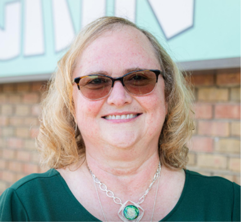
Brenda Johnston · Gahanna
“Clarity and ease of navigation.”
Q: What is the most important piece of information you want visitors to your website to see?
"I want the website to be accessible for donors, volunteers, and clients. Our site should clearly state the why."
Q: What is the most important piece of information you want visitors to your website to see?
“Ease for donations.”
Q: What would you say is GRINs biggest need in terms of website interaction?
“Analytics show most people look at the hours of operation."
Q: Why do most people come to your website? Is it to find help or to find volunteer opportunities?
Heuristic Evaluation
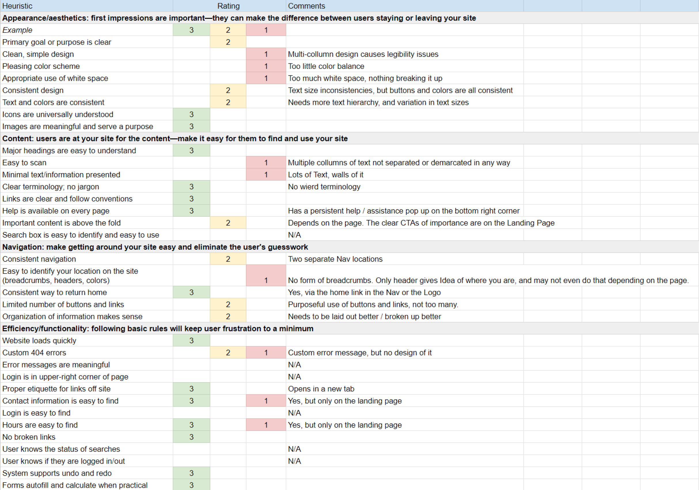
We did a heuristic evaluation of the GRIN website's main functionality, appearance, navigation, & content to help us know the key points that needed addressed in addition to the general overhaul we planned to implement.
Main Takeaways:
- Lack of consistent nav
- Lack of clean/simple design
- Difficulty finding info
- No breadcrumbs
- To much whitespace
- Feeling lost & overwhelmed on the site
To craft our User Insight Statement, we meticulously analyzed an affinity diagram derived from comprehensive interviews conducted with both volunteering individuals and a key stakeholder within GRIN.
The affinity diagram, which organizes and categorizes data to reveal patterns and relationships, served as a crucial tool in synthesizing insights from these diverse perspectives.
By examining the shared themes and significant observations highlighted through this process, we were able to develop a well-informed and nuanced User Insight Statement that accurately reflects the needs and perspectives of our target users and stakeholders.
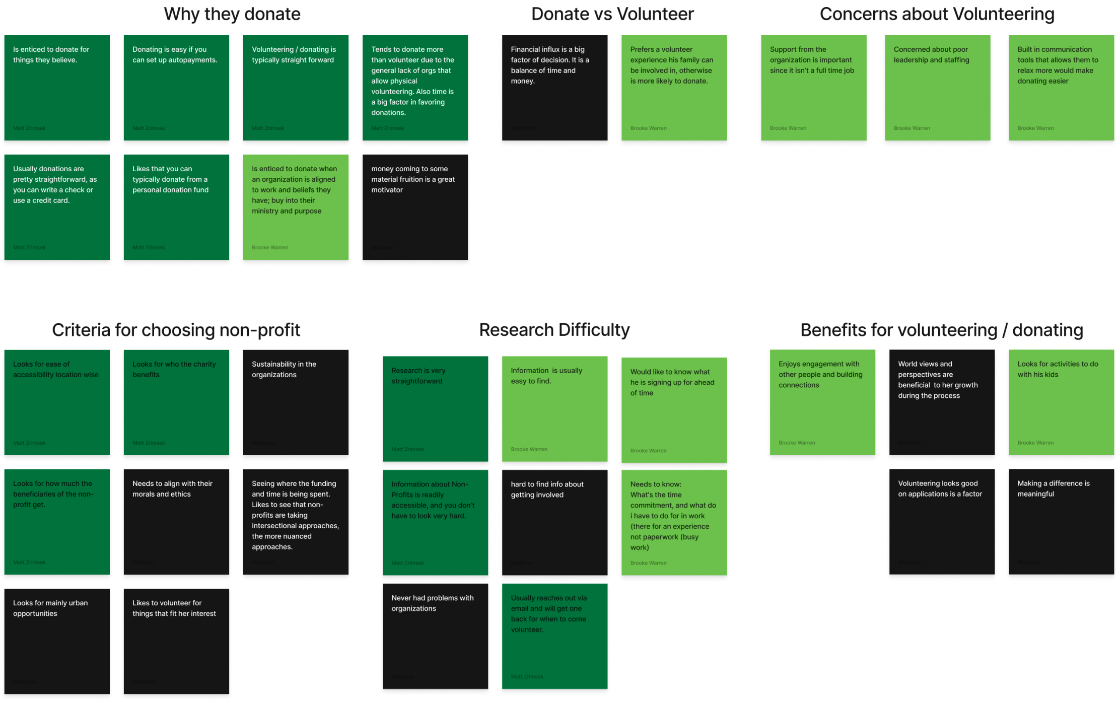
Affinity Diagram
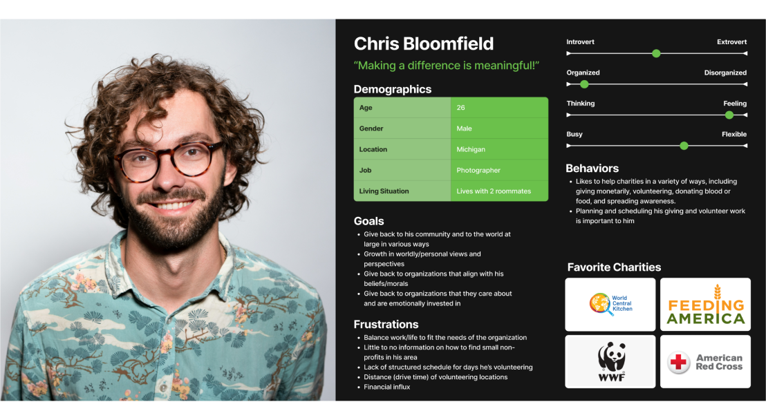
We used this design practice to develop a user persona, this diagram was based off the interviews we initially conducted to find what was most important to our said user.

Definition
Problem Statement:
We are confident that streamlining the page layouts and improving content organization for GRIN will lead to a higher click-through rate and reduced traffic loss.
This will ultimately boost volunteer sign-ups and encourage more donor contributions.
Value Proposition:
Our organization, GRIN, is currently developing a user-friendly website navigation and design aimed at making it easier for volunteers and donors to sign up and contribute. We stand out due to our commitment to supporting Gahanna Community residents.
Our credibility stems from our transparent operations and our enduring dedication to providing food to our community, a mission we have been fulfilling for the past 50 years.
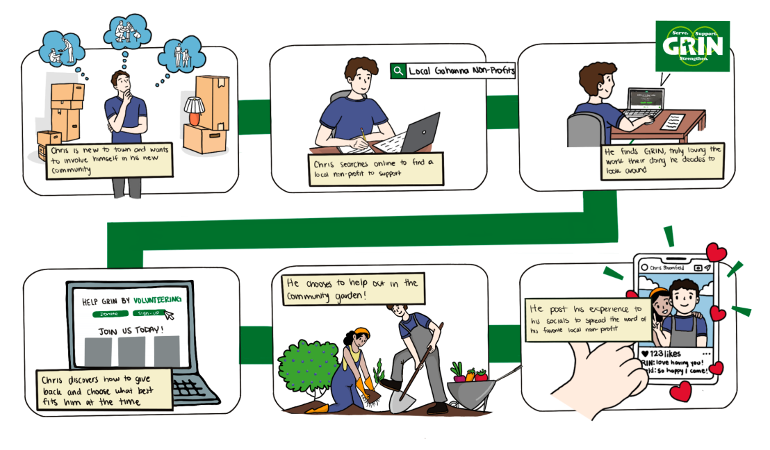
Finally using all of our research via interviews and a survey, we collated our Affinity Diagram into our Persona which we then used to create our User Scenarion and move foward with a StoryBoard that mapped out Chris' general experience with our solution.
Ideation
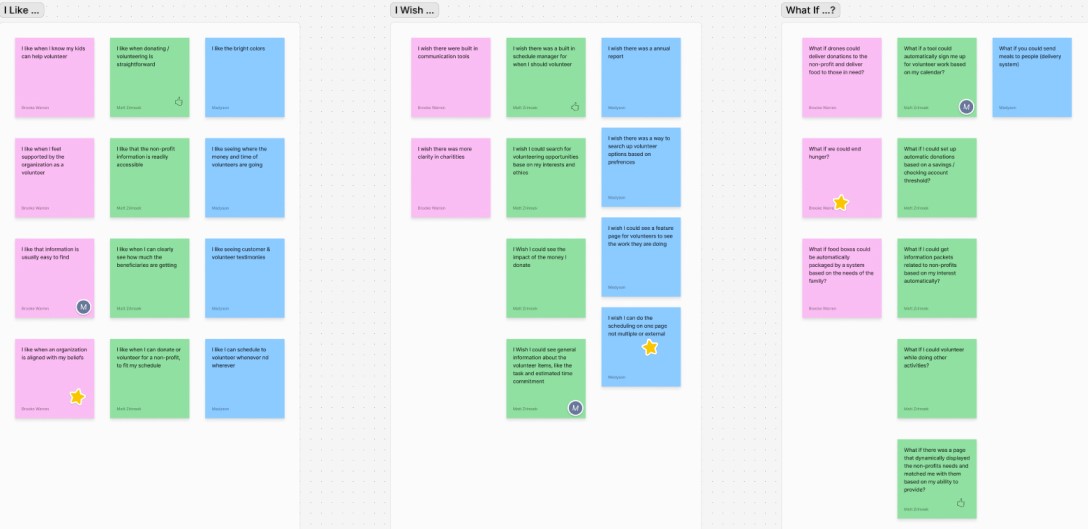
I Like, I Wish, What If...?
We engaged in the I Like, I Wish, What If? Ideation activity, a structured brainstorming exercise, to explore and develop strategies for addressing the specific pain points highlighted in our research findings.
Through this process, we examined various ideas and possibilities, which allowed us to refine and articulate the overall Value Proposition Statement that we collectively decided upon for our project.
Feature Prioritization Matrices
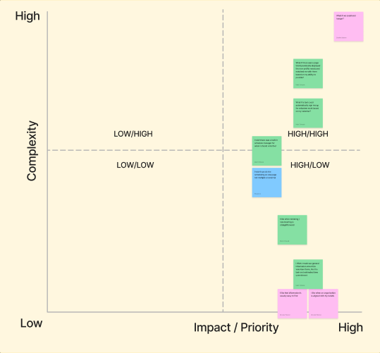
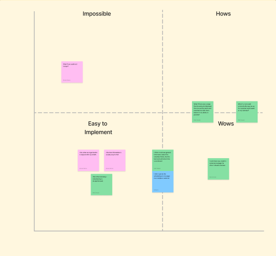
Following the ideation activity, we proceeded to create a feature prioritization matrix. This tool helped us evaluate and rank the brainstormed ideas generated from the I Like, I Wish, What If? exercise.
By using this matrix, we were able to systematically determine which ideas were most feasible and valuable to pursue, allowing us to make informed decisions about which concepts to advance in our project.


Sketches
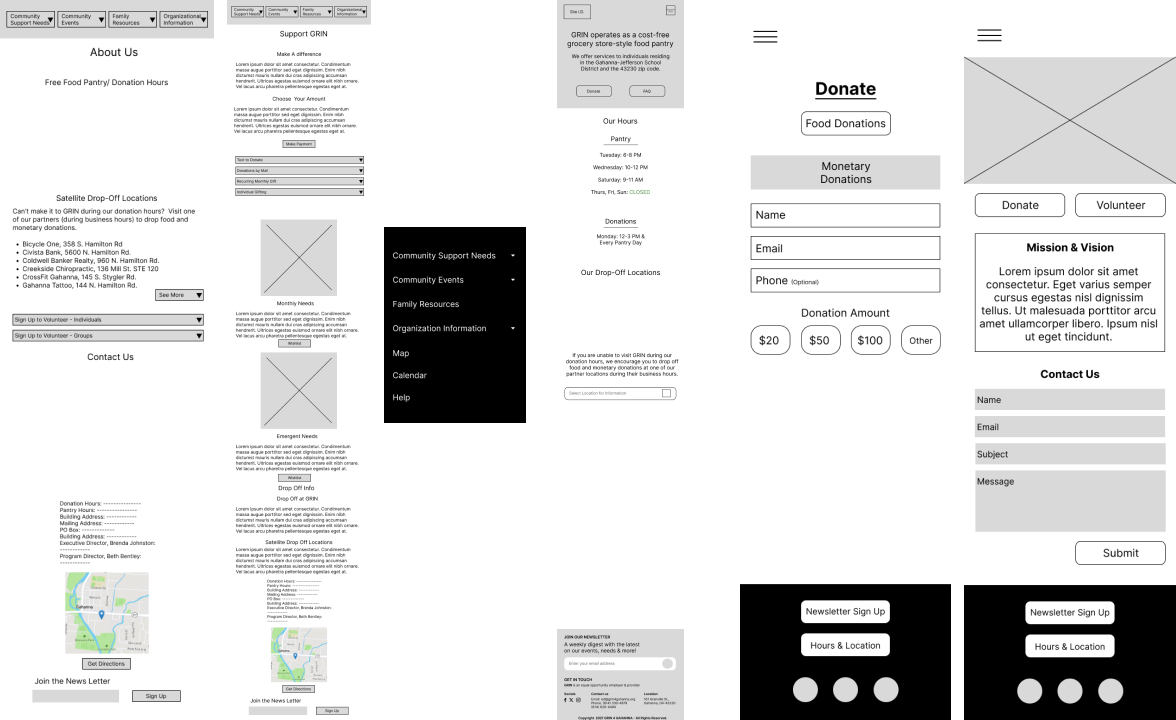
By utilizing and analyzing our own concept sketches, we were able to pinpoint and select the most promising ideas that showed potential for further development.
This careful evaluation process allowed us to focus on these selected concepts as the foundation for creating a low-fidelity wireframe, which would serve as an initial prototype for our project.
Information Architecture
We needed to undertake a comprehensive overhaul of the site layout, which involved reorganizing the existing pages to improve the site's structure. This process required not only rearranging the pages but also eliminating some of them. The content from the removed pages was integrated into other existing pages to streamline and consolidate the overall number of pages on the site.
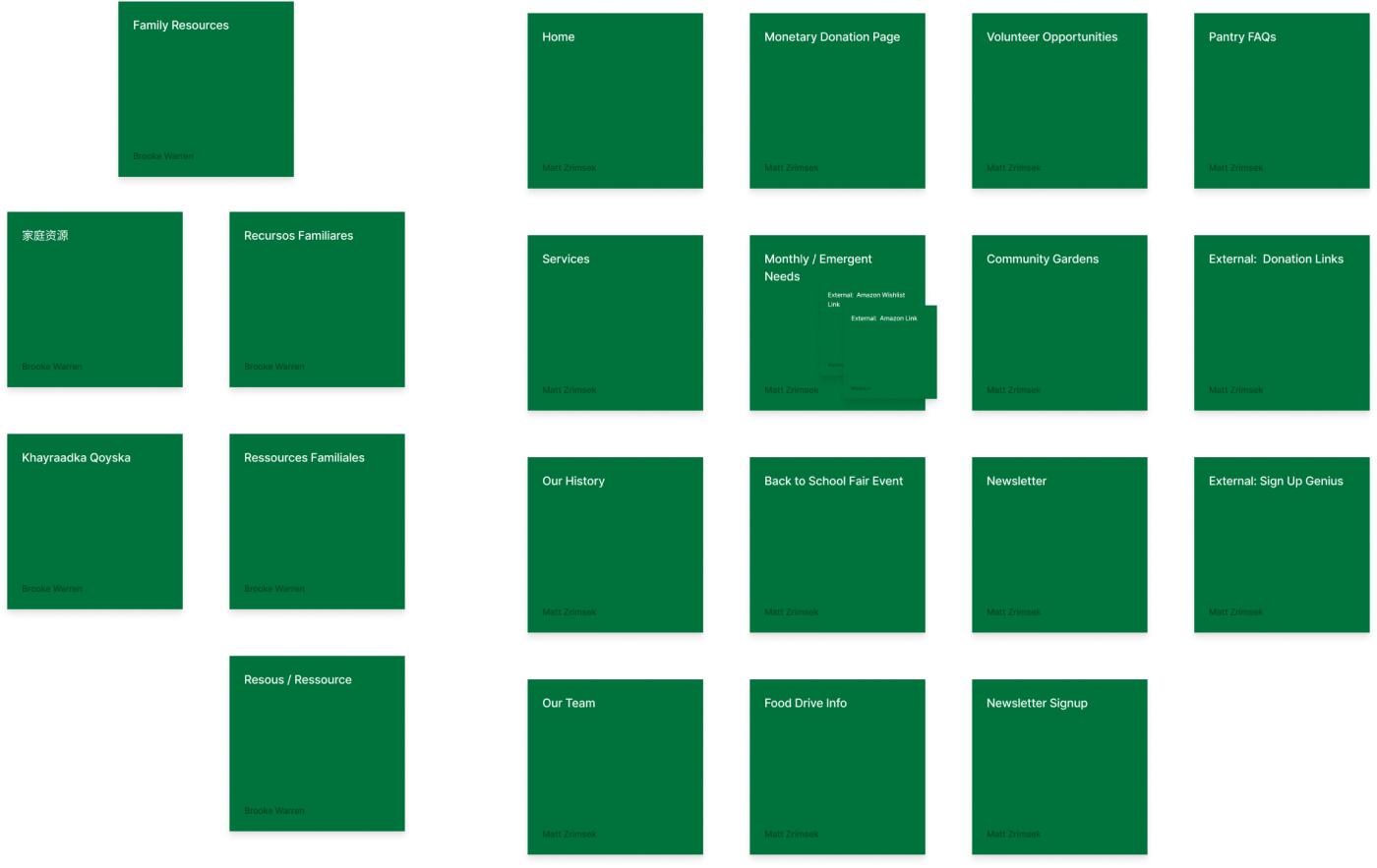
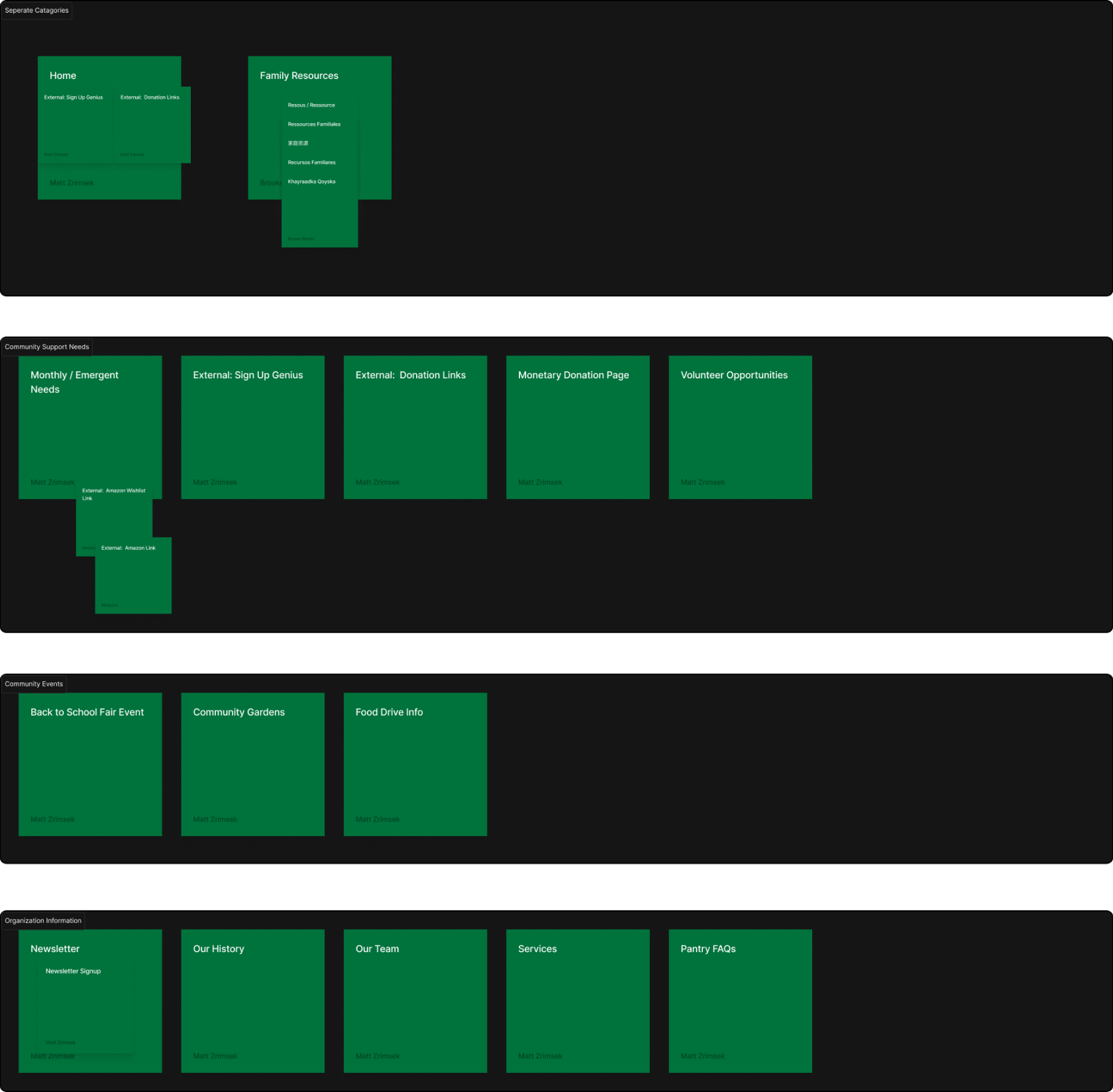
Card Sorting
We utilized the card sorting technique to explore and identify ways to restructure the site into more cohesive and streamlined sections.
This method involved organizing and categorizing content to gain insights into how best to group related information, ultimately helping us to design a more intuitive and compact site structure.

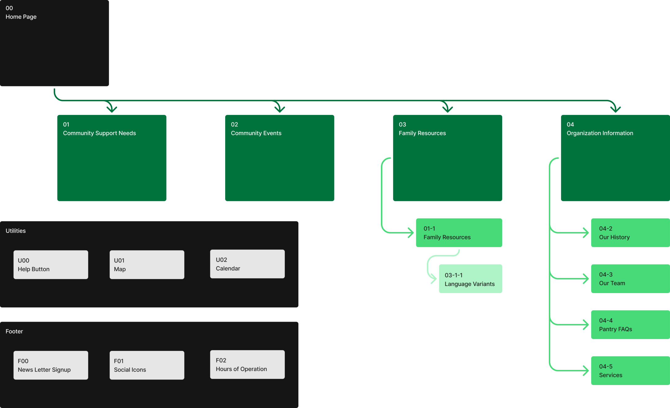
Site Map
This map functions as a crucial reference for outlining the proposed site architecture as we move forward in the design process.
It provides a structured framework that guides the development of our low-fidelity wireframes, ensuring that the site’s organization and structure are accurately reflected and effectively implemented in our initial prototype.

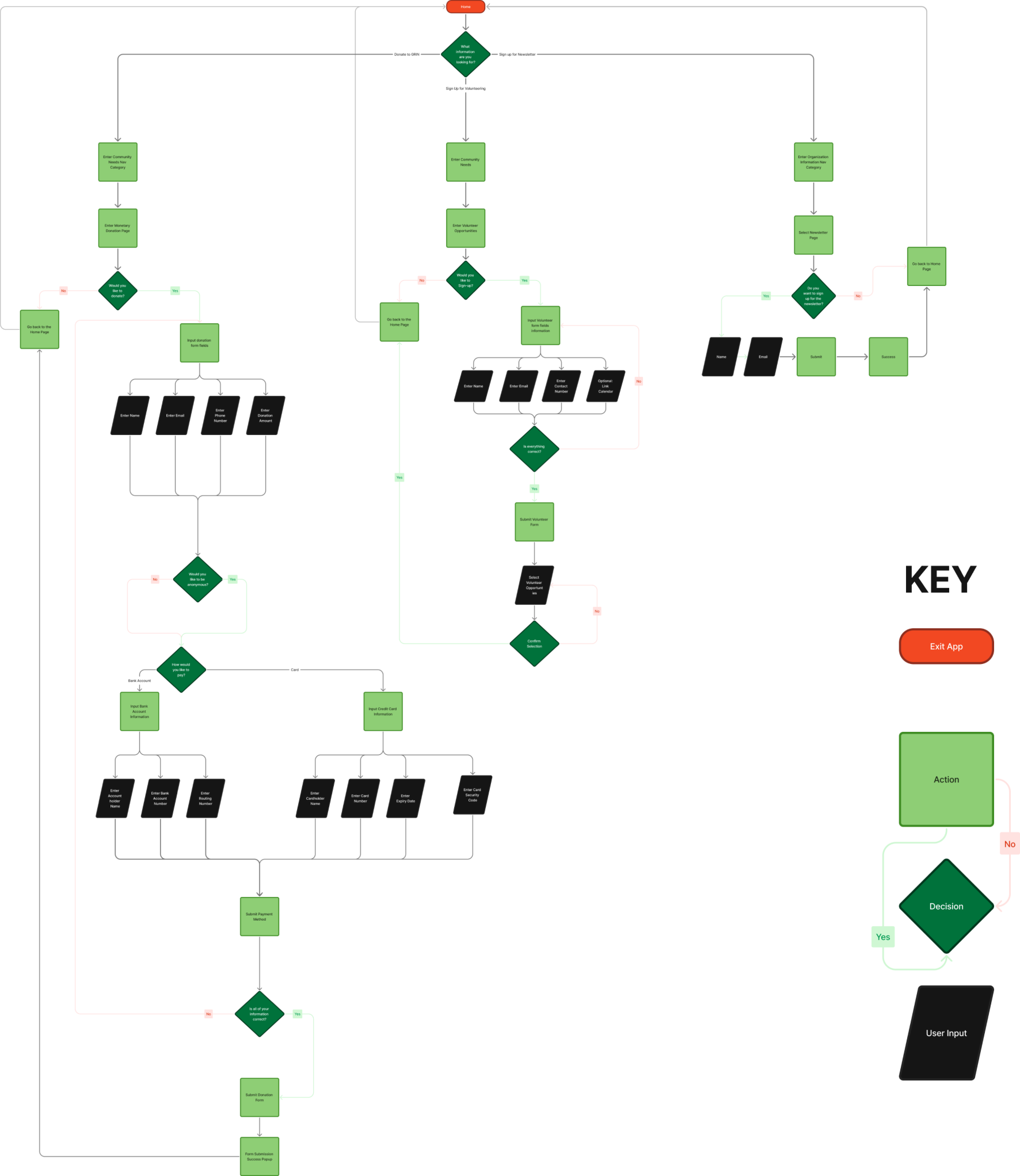
User Flow
This procedure provides a detailed guide for users on how to access essential information on the website.
It outlines the necessary steps for engaging in key activities, such as signing up for donations, volunteering opportunities, and subscribing to the newsletter.
By following these instructions, users can easily navigate the site to participate in these important activities and stay informed.
Designing & Prototyping
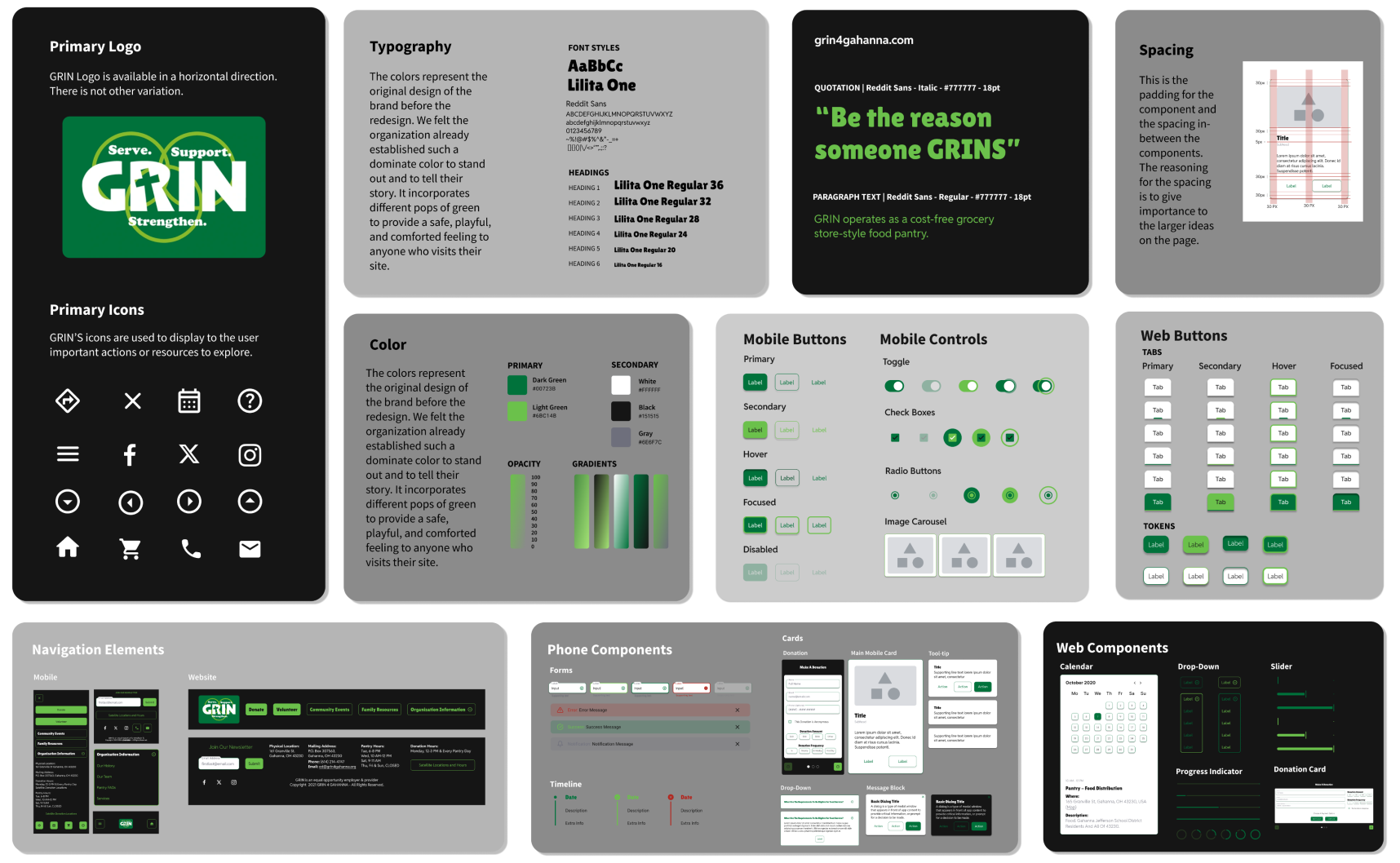
Style Guide
To start, we developed a comprehensive Style Guide following the creation of our initial low-fidelity wireframes. This approach ensured that, once we complete our initial round of testing, we will be well-prepared to apply the established Styles effectively
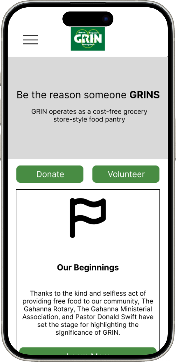
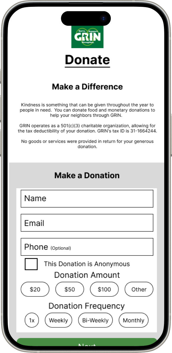
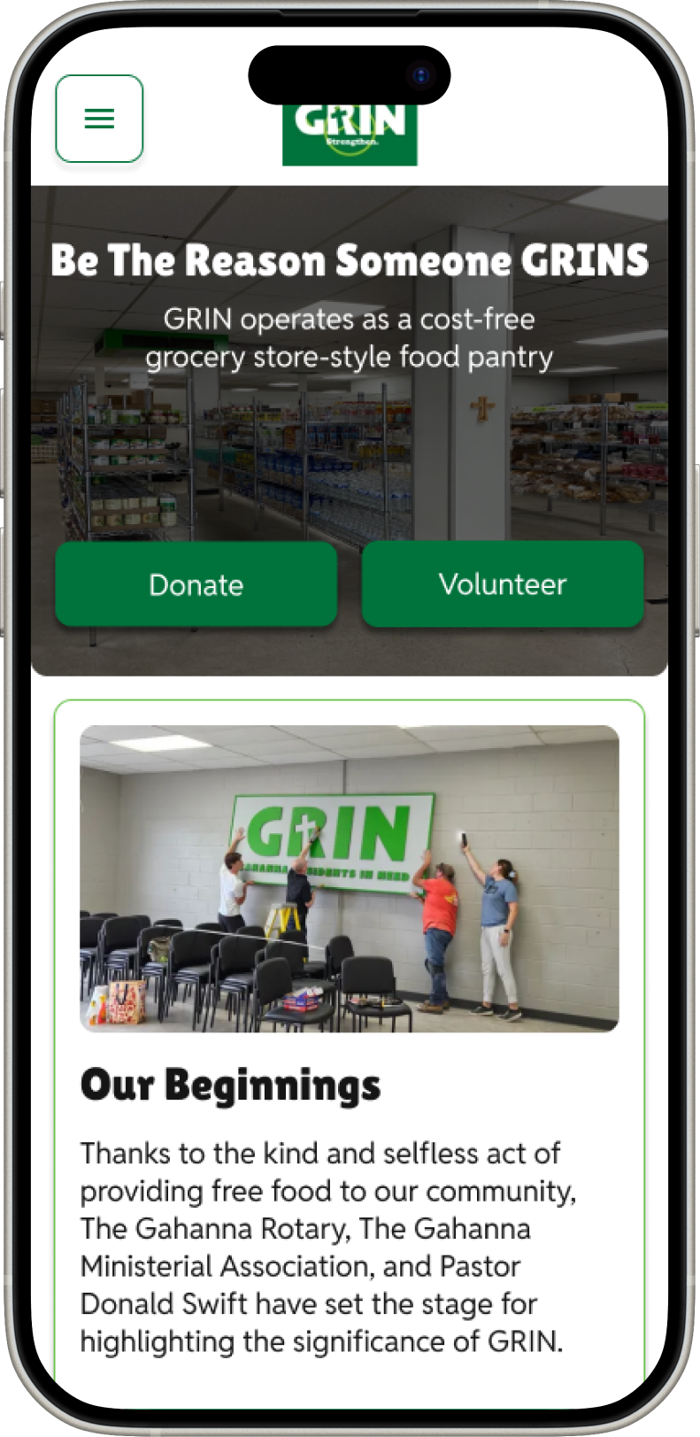
We approached our design process in three distinct stages. We began with Low-Fidelity designs to establish the basic structure and functionality. Following this, we refined and stylized these designs into Mid-Fidelity versions, incorporating more detailed elements. Finally, we addressed and integrated any feedback received to produce the High-Fidelity designs.
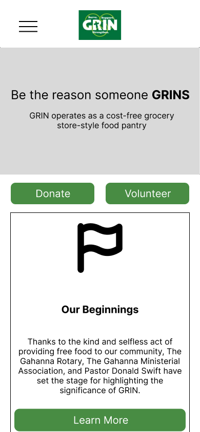
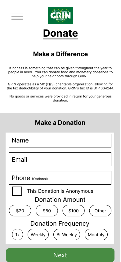
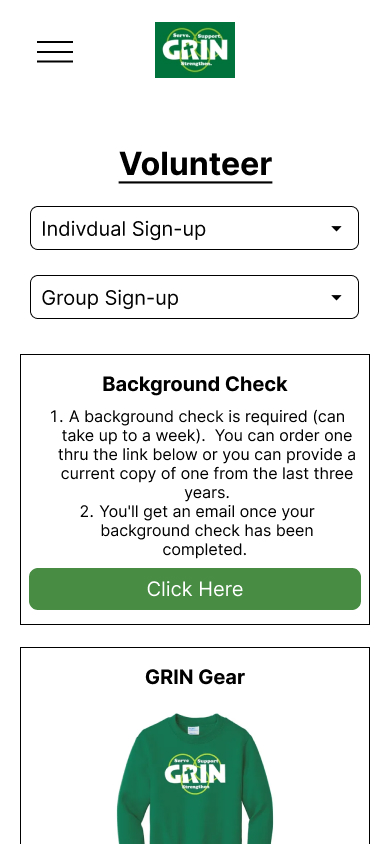
Version 1: Low-Fidelity
The initial version of our project, often referred to as the low-fidelity prototype, was meticulously crafted to serve as a foundational tool.
Its primary purpose was to encapsulate and organize all of our preliminary ideas, offering a broad yet clear representation of our vision.
This low-fidelity version was instrumental in establishing the basic framework and structure of the project, setting the stage for more detailed development and refinement in subsequent phases.
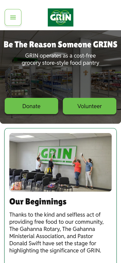
Version 2: Mid-Fidelity
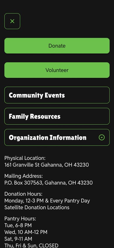
To enhance the overall visual appeal and ensure consistency throughout the project, we incorporated the style guide directly into the wireframes.
By integrating elements such as color schemes, typography, and branding guidelines, we were able to infuse the wireframes with a more dynamic and cohesive aesthetic.
This integration not only provided a more realistic preview of the final design but also helped to align the wireframes with the established design standards, effectively breathing life into our conceptual ideas and making them more tangible.
Version 3: High-Fidelity
We made adjustments to the colors to ensure compliance with color accessibility standards.
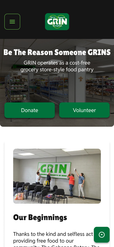
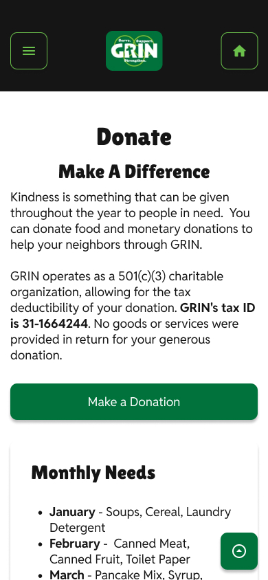
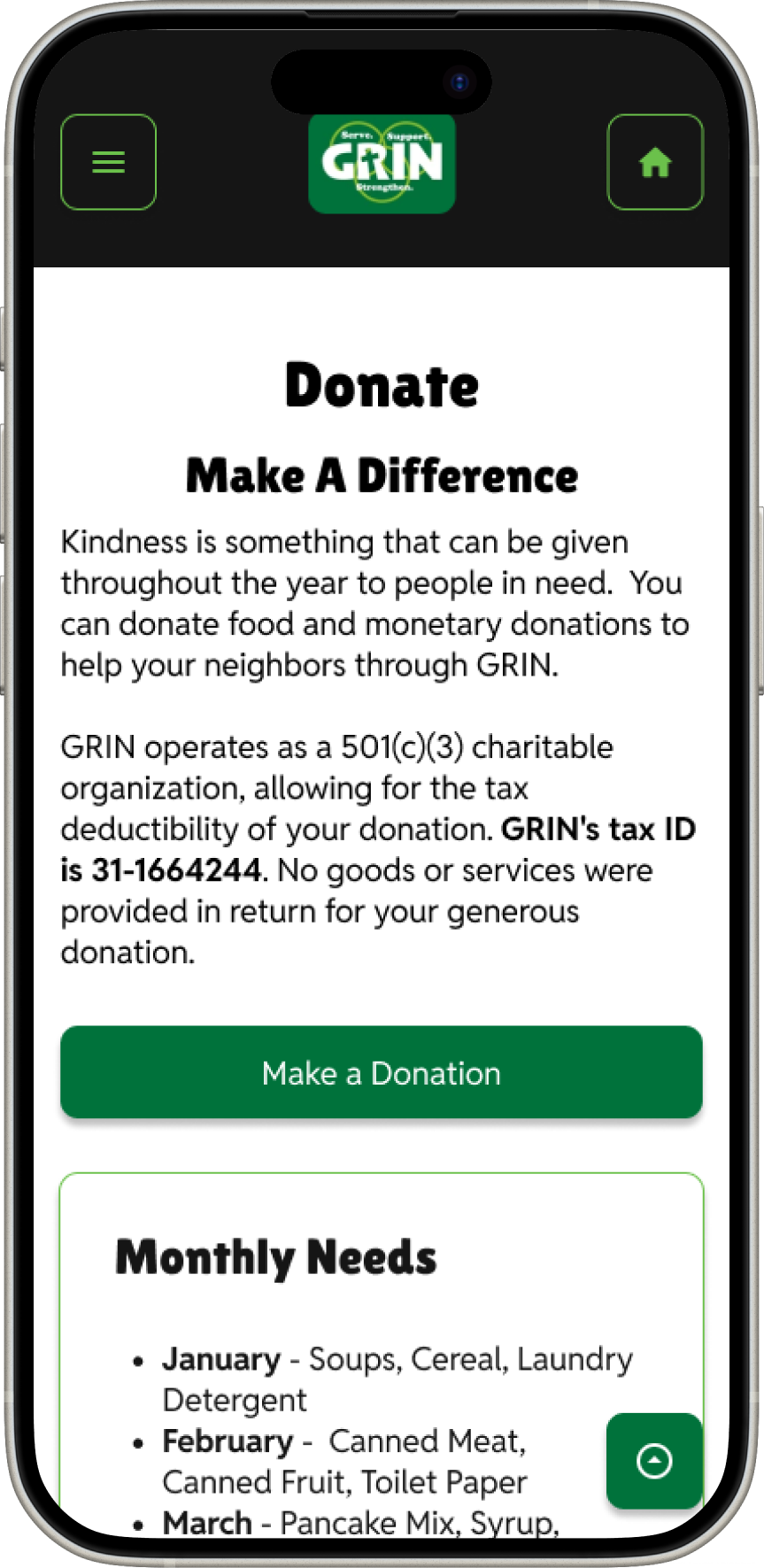
Additionally, we experimented with enclosing the cards to create a clearer hierarchy and visual separation. In response to user feedback about longer-than-expected pages, we added a back-to-top button.
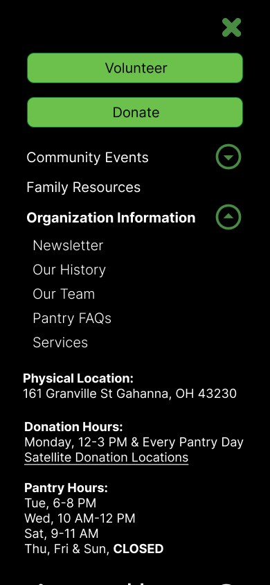
Moreover, we included an extra homepage button on the color block navigation bar to improve user navigation.
Testing
Wireframe Testing
Ease of Use
Users generally found the information presented in an understanable way.
Navigation Categories
Users found that some navigation categories were redundant.
Footer Information
Users didn’t think to look for some information in the footer, expecting it to be elsewhere.
Mid/High Fidelity Testing
Usability
Users were able to quickly navigate to their target destination with little issue.
Information Organization
Liked the extra information in the navigation action partly like a normal footer.
Page Length
Users mentioned that a return to top page functionality would be useful.

A/B Testing
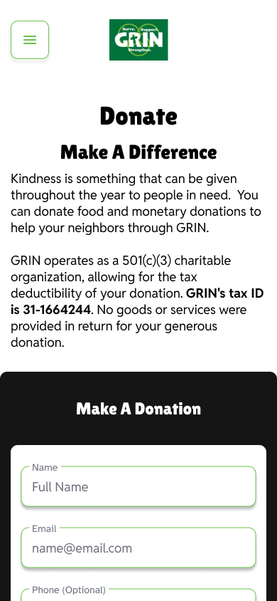
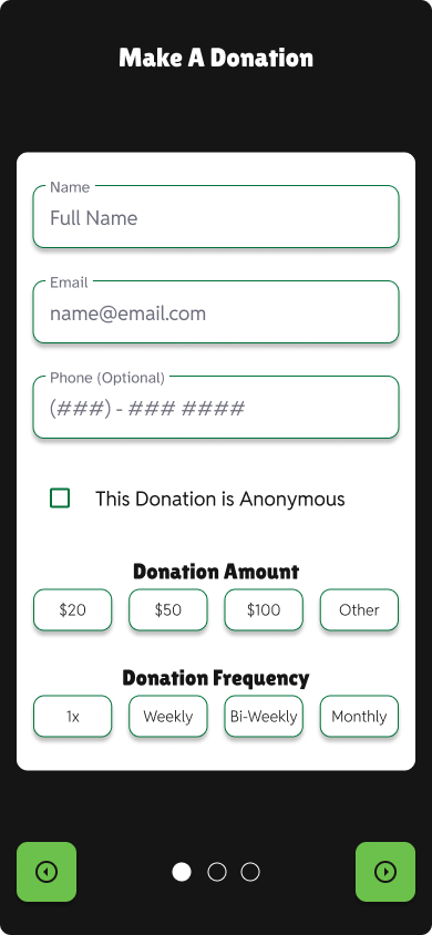
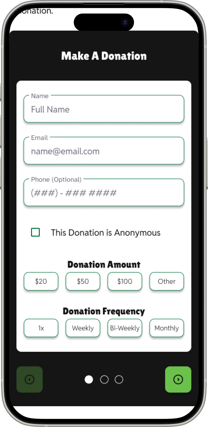
We tested the different experience users had with the donation flow, accessing it through a button, or through an imbedded form.
We found that users noted a more immersive and clean experience when using the button that took them to the exclusive donation flow.
Next Steps
Share with the Non-Profit
Share the designs with the GRIN board and volunteers to make sure we are meeting their needs & wants.
Ideate on Feedback
Make the necessary ideations to our clickable prototype and present to GRIN and its stakeholders.

Hand off to web-developers
Finally, work along side their web-developers to make a fully functioning website for GRIN.
